
Facilitating a Protein Powder for Every Body, for Every Need
case study · 7 min read
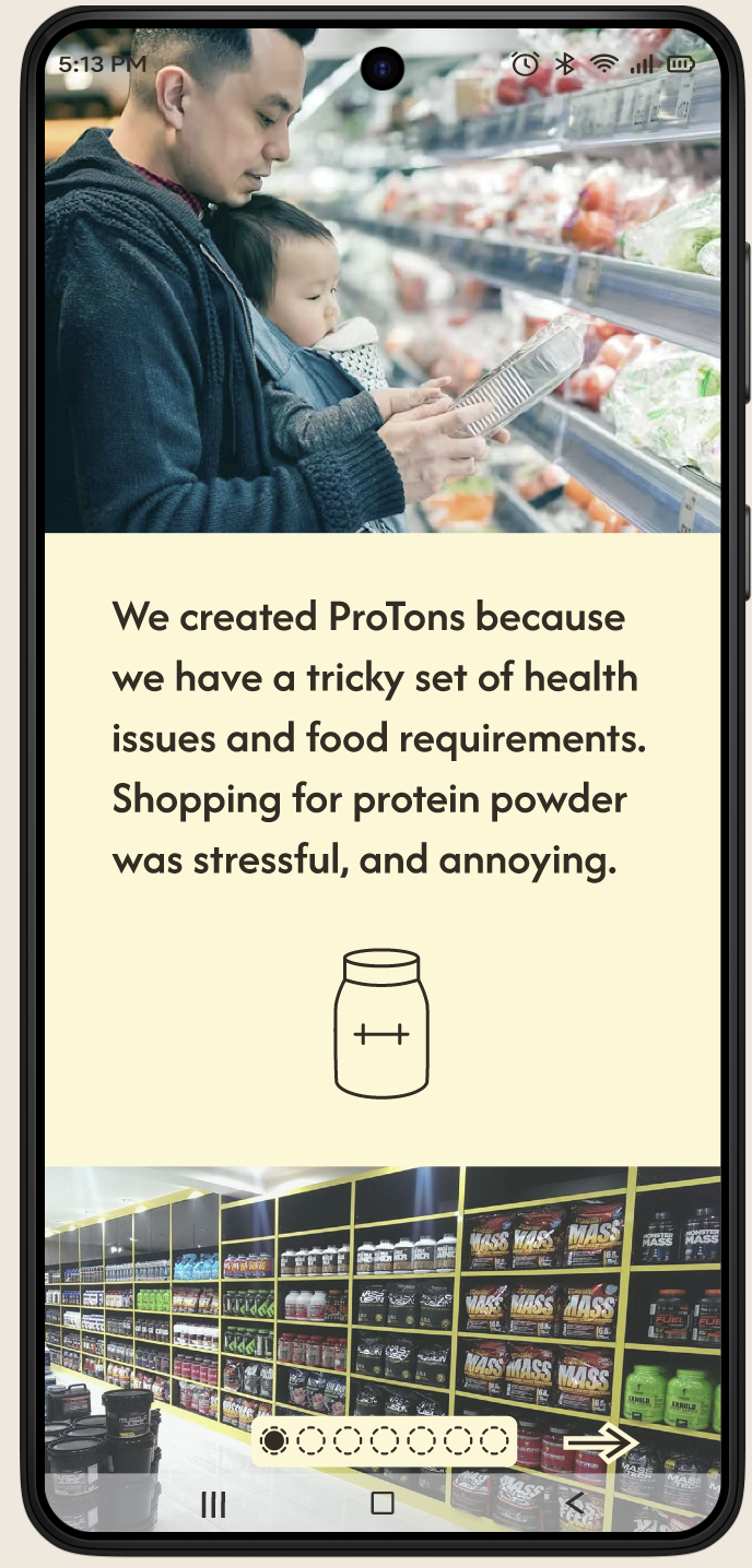
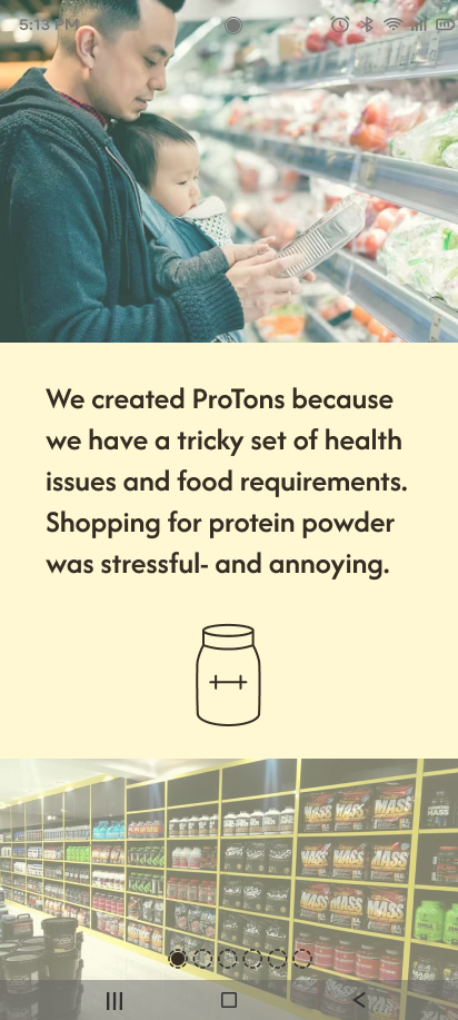
Finding a protein powder that meets your dietary restrictions is frustrating and opaque.
Self-reported food intolerances affect almost 1 in 4 people. Meanwhile, the global protein supplement market's annual growth rate has exploded over the last five years to over 29% of the population; this growth was significantly influenced by the COVID-19 pandemic, which heightened health and wellness awareness and boosted sales of supplements.
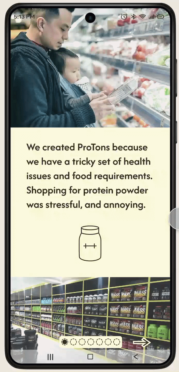
Trying to comb through ingredients lists on various popular protein powder websites can be taxing, frustrating, and time-consuming for all those with limitations on their diet.
For this case study, I wondered: how do we make protein powder discovery fun, validating, and less stressful?
Process
User research and synthesis, ideation, prototyping, interaction, usability testing
My Role
Sole Designer
End-to-End App Development
Tools
Figma, FigJam, Miro, Mural, Optimal Workshop, Google Workspace
Duration
12 weeks
June-September 2025
The goal:
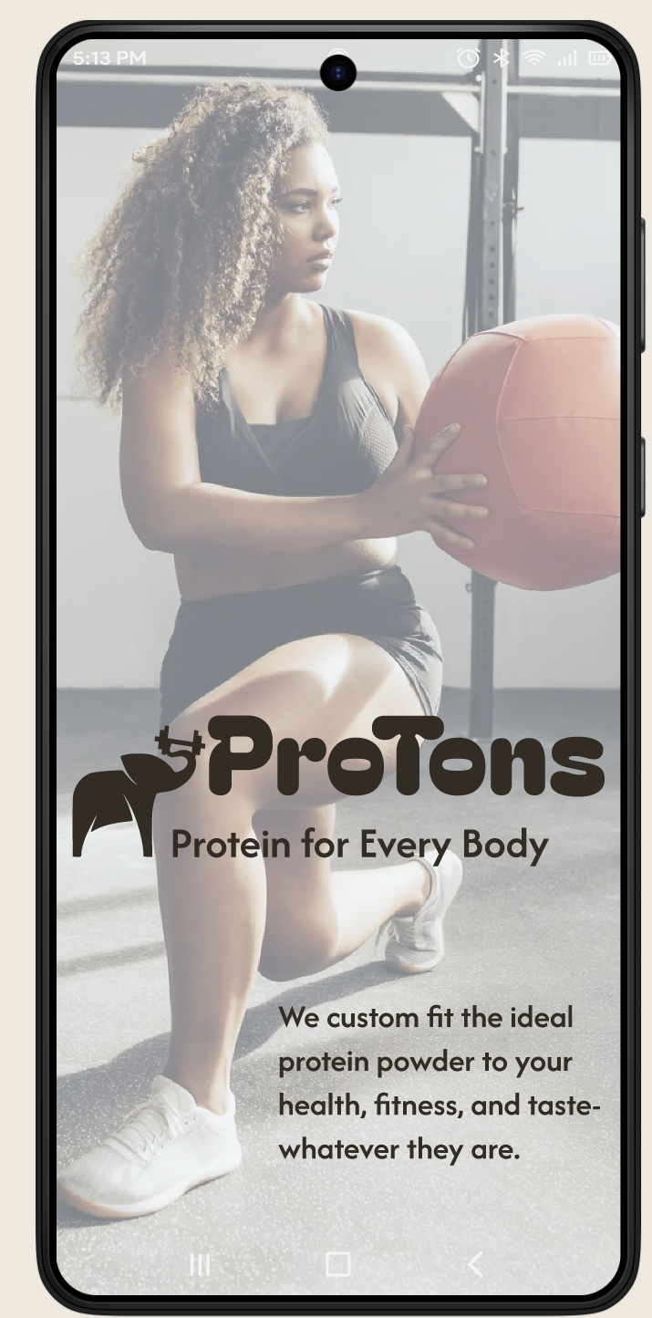
Determine if non-traditional consumers (outside the "gym bro" archetype) would be more likely to make inclusive, sustainable, and healthy choices if there was an intentional Goldilocks space that focused on finding just the right supplement using taxonomic hierarchy.
A "Goldilocks" Space for Nutrition
Where users can:
Find protein powder they can safely consume,
Purchase the product,
Explore potential recipes to maximize the benefits of their purchase
Innovative tools that borrow from the worlds of SaaS and deep research
Utilizing business tools through a consumer lens, our customers are supported through dynamic nutrition guidance resources, and empowered to make decisions that are informed without requiring an abundance of bandwidth.
Research:
The protein and supplement market is highly competitive and features diverse business models; success in this dynamic industry requires more than just a good product or content; businesses must understand their model's strengths and weaknesses, adapt to market trends, and address threats like regulatory changes and competition. Long-term growth will depend on building customer trust through consistent quality, transparent practices, and personalized experiences, likely achieved with AI tools.
I dove into research to generate a strategy and develop brand identity.
● Competitive analysis
● User interviews
● Affinity mapping
● Exploring opportunities through POV & HMW
statements
● Customer story map
● Developing user personas
Competitive analysis findings
While some of these businesses are young upstarts and others are established veterans, all of them have certain strengths; however, none of them offer hierarchical taxonomy searching (by sustainable, women-owned, BIPOC-owneed, GLBTQIA-owned, accessible, etc) which creates noted opportunities in the industry.
Strengths:
Massive inventory, fast shipping, low prices
Weaknesses:
Zero taxonomical hierarchy for complex allergens. Filters are broad and often inaccurate. "Filter failure" is common.
Retail Giants
Amazon, GNC
D2C Brands
MyProtein, Huel
Strengths:
Strong brand loyalty, community feel.
Weaknesses:
Limited to their own proprietary products. Echo-chamber marketing.
Specialized Sites
The Feed, Bodybuilding.com
Strengths:
Performance-focused data.
Weaknesses:
Alienating "bro" culture. Focus on hypertrophy often over health/safety.
User Interviews:
01
What values and requirements drive your supplement planning?
02
What apps or websites do you currently use?

03
How do you stay organized while tracking your nutrition?
9 remote interviews of potential users ranging in age from 37 to 61. My users live across the US, but predominantly the Midwest, East Coast, and Southeast. They include cis and trans men & women, and have a variety of economic backgrounds. They also all have a variety of health or diet limitations, ranging from Celiac to diabetes, lactose intolerance, vegetarians, and a smattering of allergies.
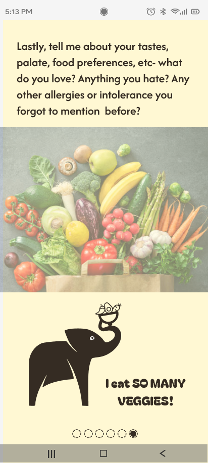
While my subjects were encouraged to share as much as they felt comfortable about their health and fitness journey, I focused on the following questions:
04
What unexpected discoveries have you made while shopping?
05
How do you validate the safety of a product before purchase?
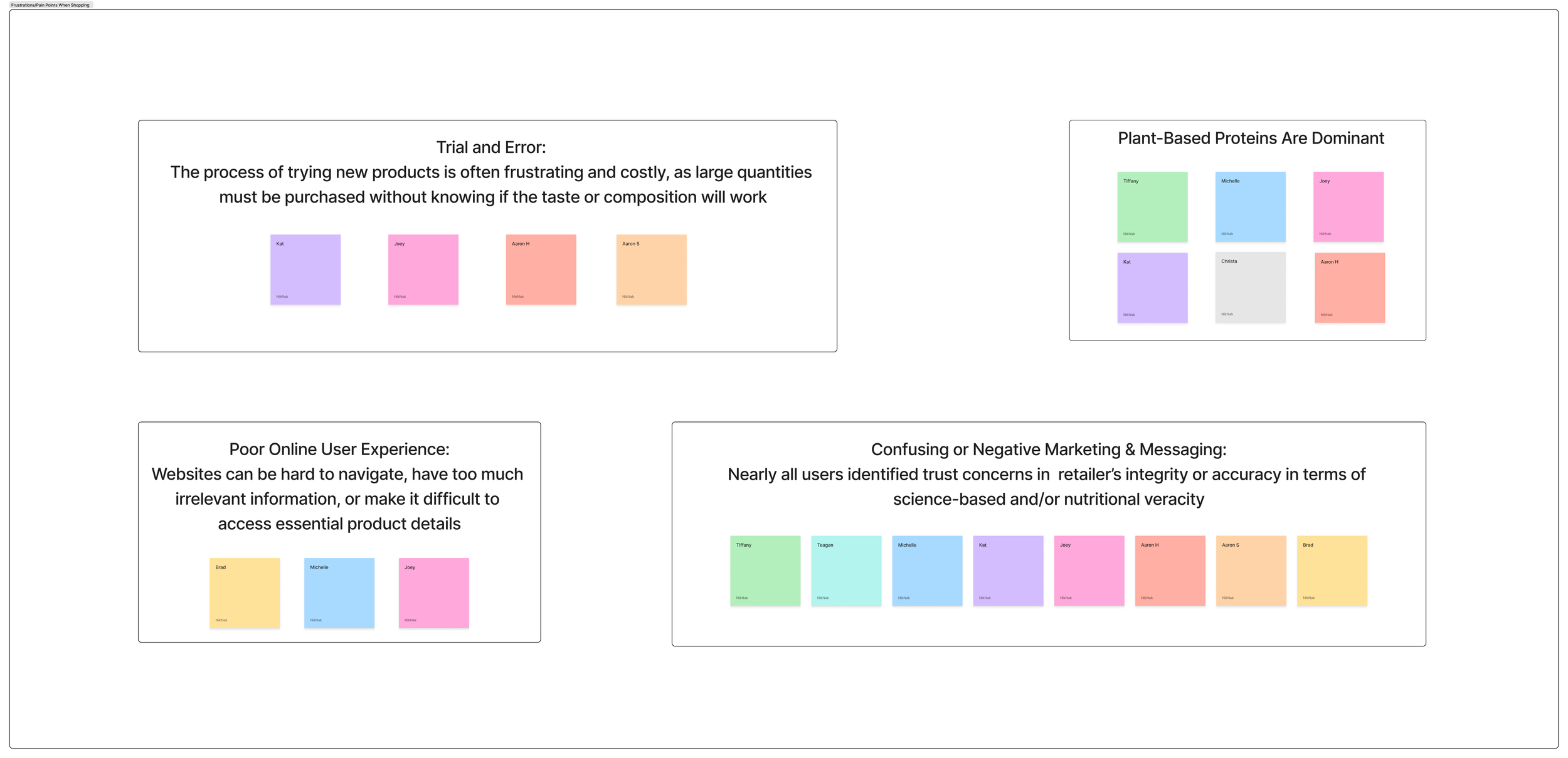
What we learned:
Interview insights:
Our target user is deeply knowledgeable but poorly supported. They are looking to find the balance between prioritizing a nutrition plan that is unique, meaningful, comfortable, and reflects their values, while also conforming to budgetary and logistical expectations.
There was a strong focus on muscle gain for overall health, bone density, or body recomposition.1 This challenges the industry standard of marketing protein powder solely for "bulking" or "shredding."
Users view protein as a medical necessity for longevity, particularly the older demographic (40-60s).
The challenges of information overload and balancing personal taste preference with health requirements also suggest opportunities: design interventions that streamline the shopping process and empower consumers to make informed decisions that reflect their unique needs.
Feedback was organized into the following key areas:
Body Change, With Intention
Diverse Physical Activities
The "Free-From" Priority
The Trial and Error Tax
Trust and Transparency
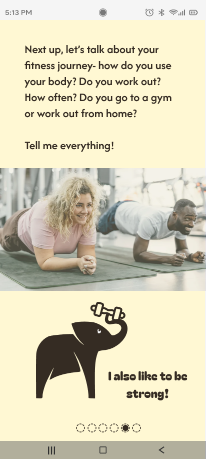
Notably, users engage in a variety of activities beyond structured gym workouts, such as running, cycling, yoga, dog sports, dancing, and Pilates. The app needs to speak to the "Gym Nerd" and the "Dog Walker" with equal respect.
Through user interviews I developed personas to represent my primary user; our user identifies as diverse or marginalized, often has access needs, and values transparency in brand identity.
And I examined the potential journey of one of these user personas…
A targeted space to support our users on their journey will be highly valuable, if build with intention.
Primary pain points and challenges outlined in the protein shopping process:
Difficulty finding niche/specific vendors
(e.g., Peanut-Free Facilities)
Overwhelm and information overload
(The Paradox of Choice)
Time constraints & executive function struggles
(Decision Fatigue)
I aimed to address each of these pain points through a separate user flow.
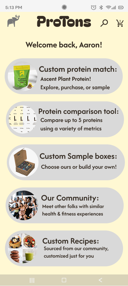
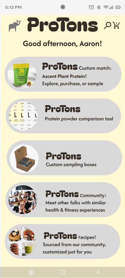
protein match onboarding:
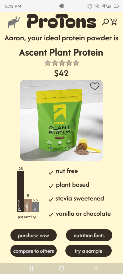
AI-assisted onboarding that finds best protein powder match
Key features
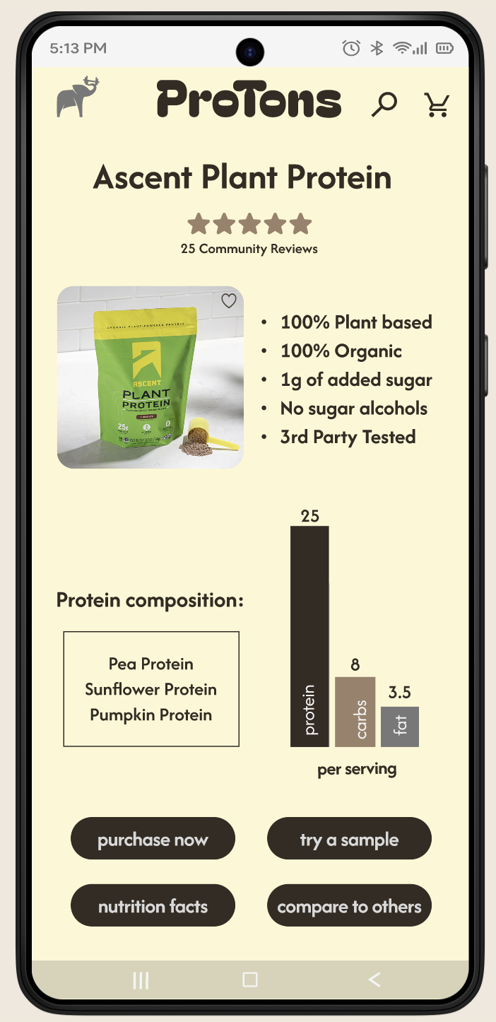
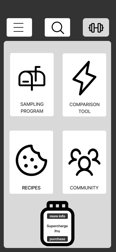
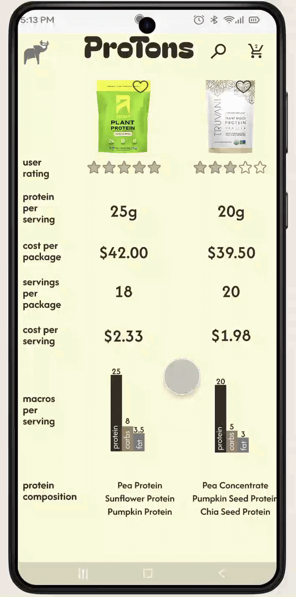
comparison tool:
evaluate user ability to select from pre-filtered protein powders, then refine with a comparison table
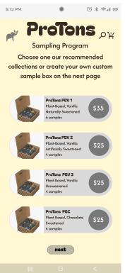
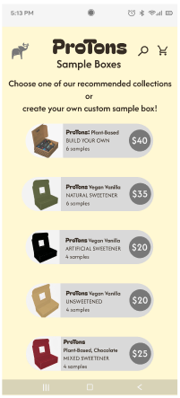
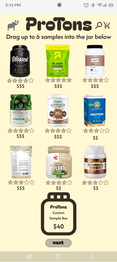
sampling program: observe how users explore matched protein options to choose proprietary or customized sample packs for at-home testing
Task Flows & User Flows for ProTons
After analyzing these personas and essential user journey, I realized my users represents three stages of their own evolution, and our brand can potentially support our user as they evolve:
Tyler is a fitness novice, but after learning more about his own body and what it needs to be sustained, he’ll potentially ‘graduate’ to hold the knowledge and confidence of Tai.
Tai is more confident in their education, but has been on such a long journey with their ever-changing body that they still have more to learn. With time and practice, they’ll potentially hold the experience of Erin.
Erin is at the final stage of her fitness & health evolution, with both the experience and knowledge to empower her to make the best decisions for herself. Having access to more sophisticated tools will meet her needs.
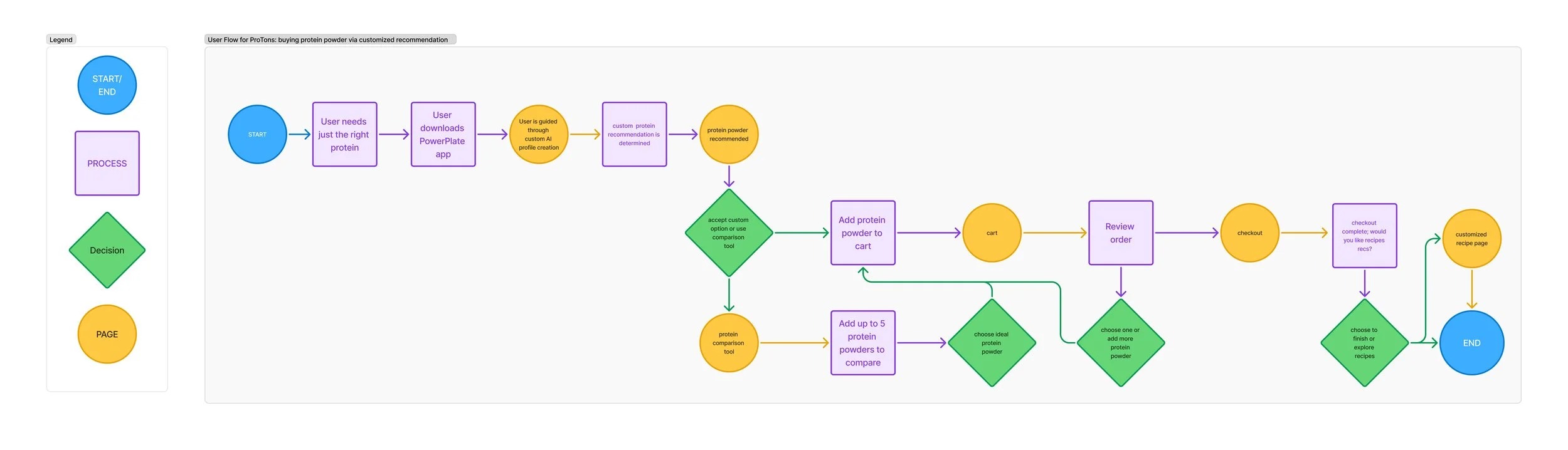
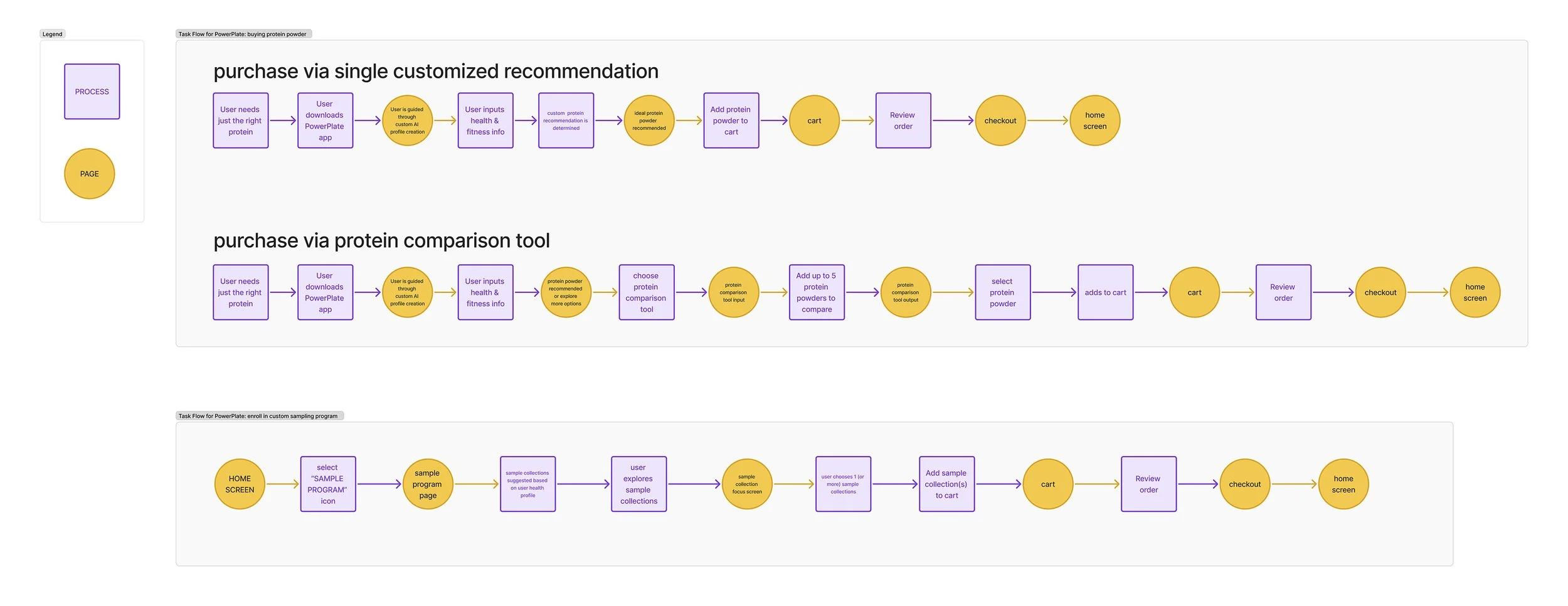
User Flow: Buying protein powder via customized recommendation:
Task Flow: Purchasing protein powder in the app
Design:
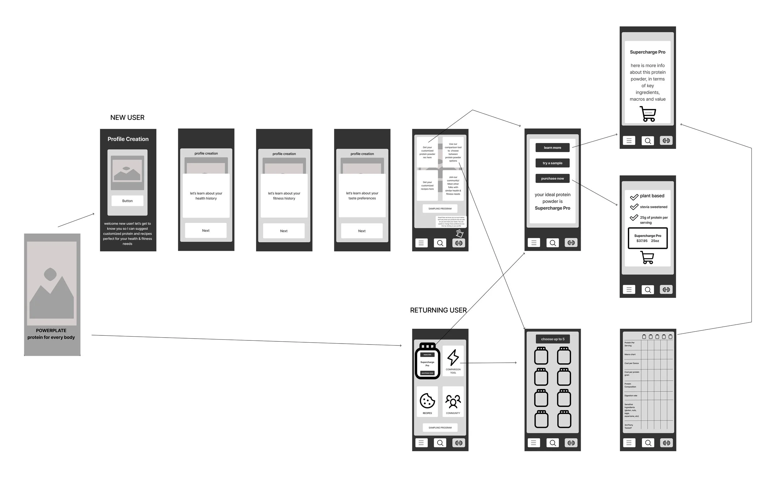
I began by prototyping at the most essential level, first developing basic wireframes, and developing a more dynamic wireframe flow
Next I sussed out visual direction. I focused on a modern but universal logo that felt gender neutral, egalitarian, and visually accessible to everyone.
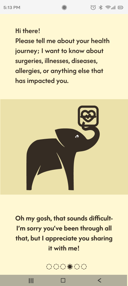
I wanted to establish brand values and trust immediately, without artifice or manipulation, and create a character and face for our AI model.
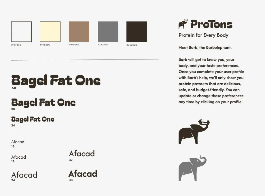
UI Kit
Style Guide
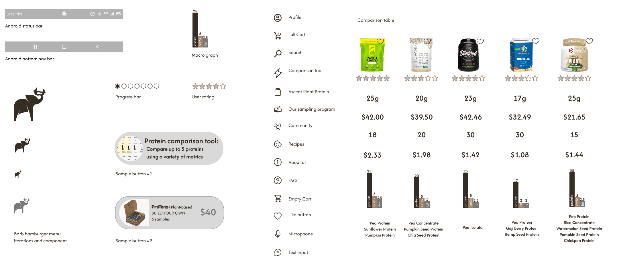
Hi-Fi wireframes: Round 1
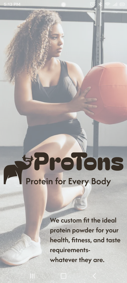
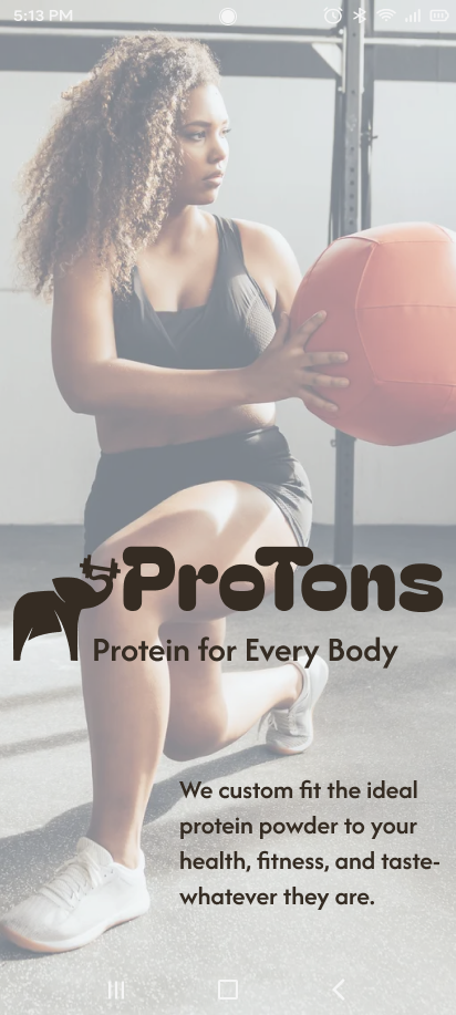
A dissolving opening screen to set the stage
Allowing users to calibrate their baseline establishes trust
I developed a Usability test plan and asked 4 users to test three core flows:
onboarding to a custom protein match
a comparison tool
and a sampling program
Final User Testing Outcomes determined that Visual consistency across the UI was highly valued.
The comparison table's usability needed improvement.
Users had questions about AI data privacy and use.
Navigation clarity was key during the onboarding process.
Hi-Fi wireframes: Round 2
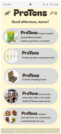
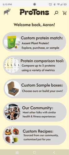
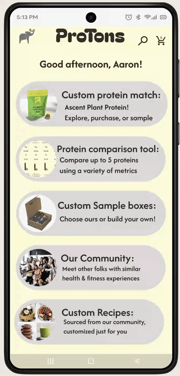
Homepage Confusion: Returning user layout was preferred. New user page feedback was split: some liked the abundant communication, while others wanted more tangible, graphic-supported examples of functions. The intro screen was retained as common for all users; the more abundant onboarding was chosen for new users. Returning users are quickly shown their custom protein match.
Standard
New User
New User Next, etc
Returning User
From here, I conducted user testing through 5 more recorded remote interviews, to better understand their needs and reactions as they interacted with two high-fidelity wireframe prototypes of my ProTons app.
Takeaways & Changes for final High-Fidelity flow:
Navigation: Use the brand logo as a "return to home."
Test including the hamburger menu early in flows, but dropping it deeper into the experience, as users were divided on its constant presence.
Homepages: Re-conceptualize and streamline the two different homepages
Checkout: Streamline the checkout process for all three flows.
Proprietary tools: Simplify visuals to maximize impact
Onboarding: Expand the onboarding flow to clearly communicate the AI module's capabilities at every fidelity.
Sorting Tool: Simplify confusing sorting tool copy to reduce user effort. Consider additional tree testing or sorting feedback.
Copy Refinement
Develop thoughtful, brand-centric copy for all steps to build brand trust and convey the full value of the bespoke protein powder experience. Consistency is key.
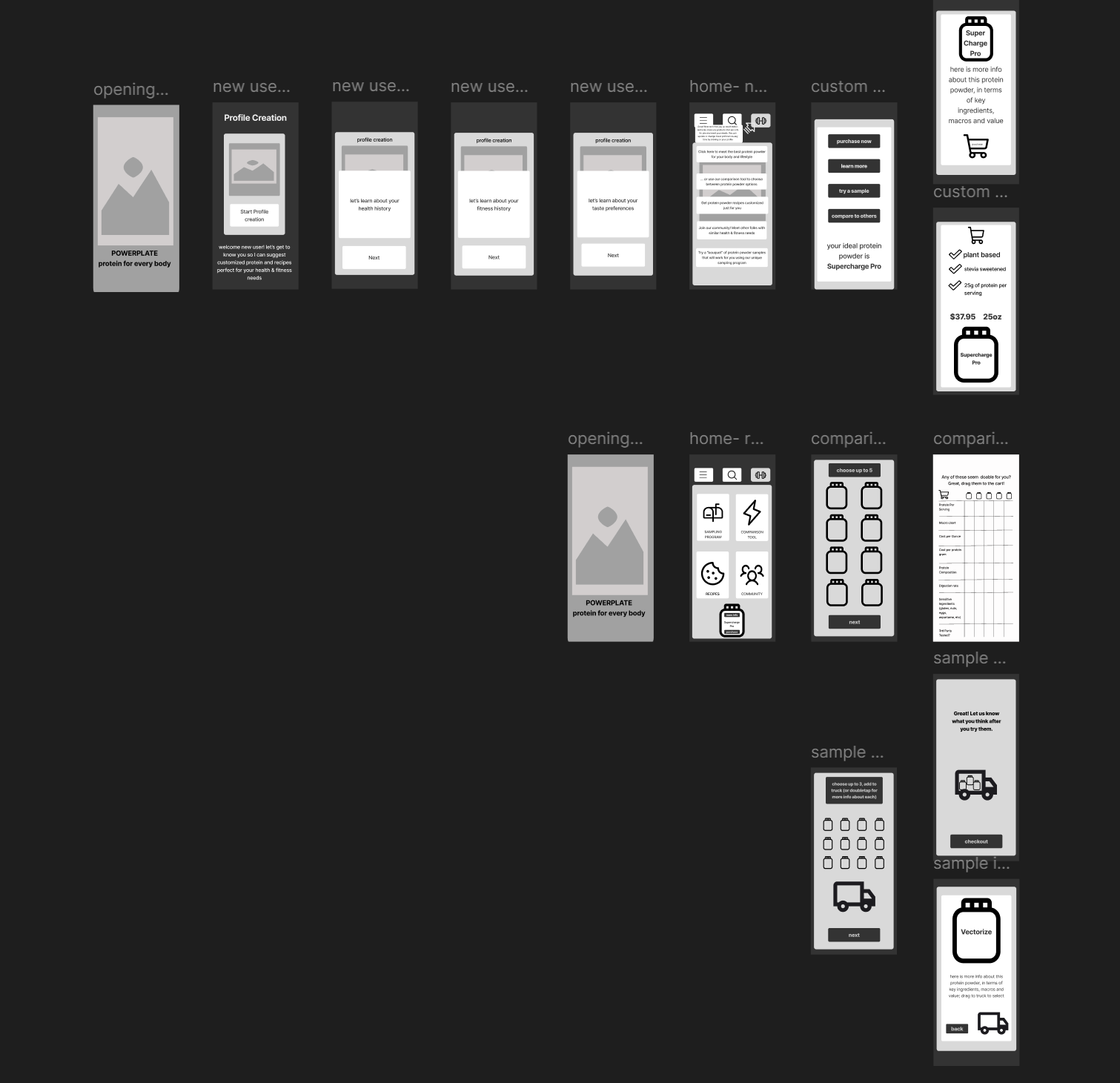
Hi-Fi wireframes: Round 3
Home Screen Updates: button evolution
Iteration 1
Iteration 3
Iteration 3
Improved Onboarding Experience
Iteration 5
Iteration 5
Custom Protein Box screen: streamlined buttons, clarified that each button also moves user to next screen
Hi-Fi wireframes: final prototype
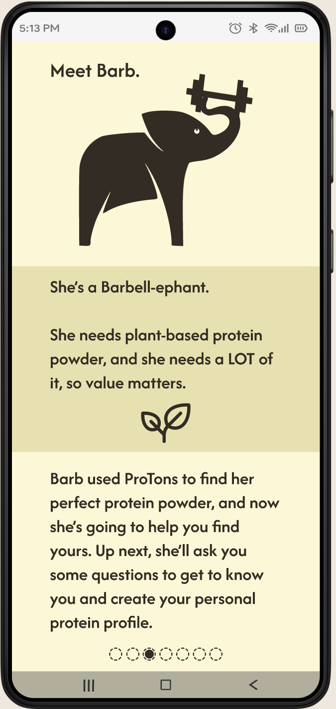
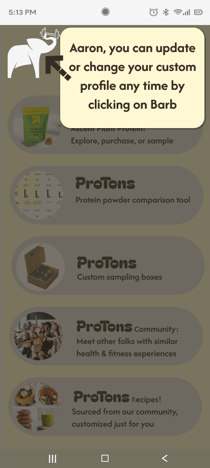
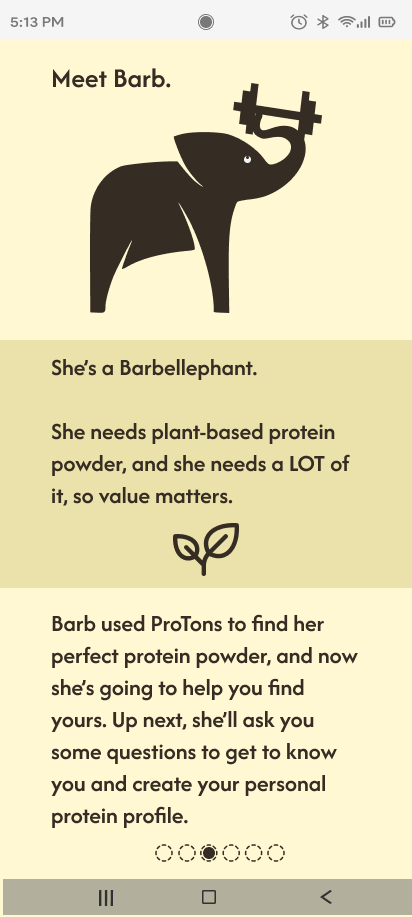
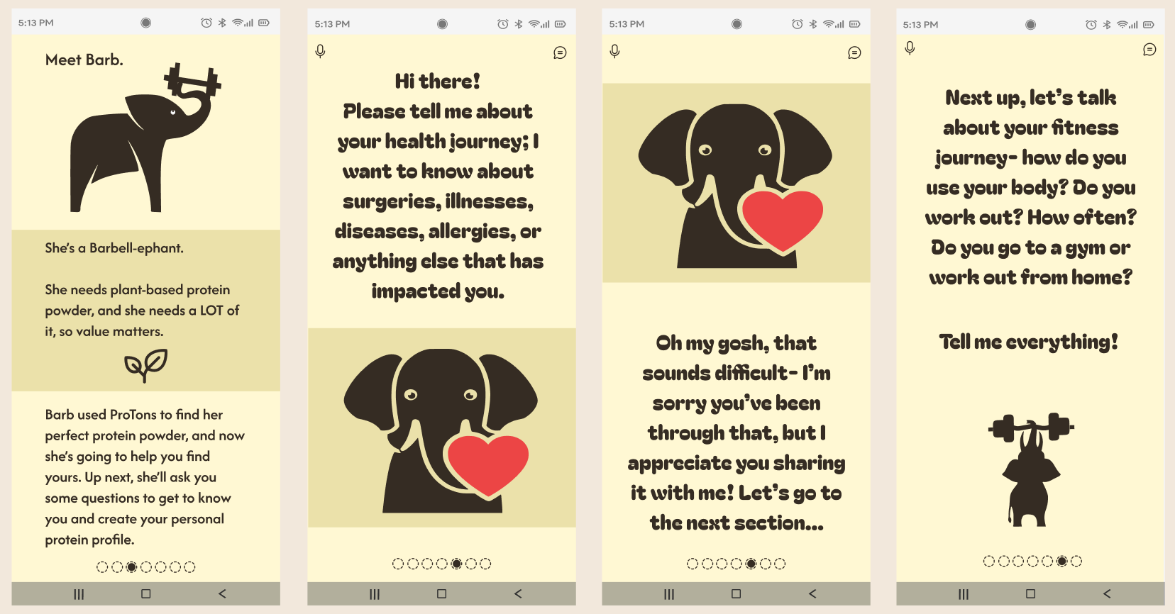
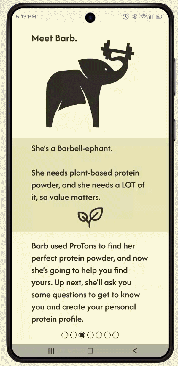
At the highest fidelity, I undertook a design that streamlined my user’s needs, looked beautiful, and created an environment that users want to “play” in. Anthropomorphizing our AI character Barb created familiarity and trust, developed user relationships, built brand recognition, and eventually user loyalty.
Final wireframe flow
At the highest fidelity, I undertook a design that streamlined my user’s needs, looked playful, and offers a clean solution to an ongoing problem.
ProTons: Final User Flows
Opening Flow - Meet Barb
User Flow - Sample Box
User Flow - Comparison Table
User Flow - Checkout for returning user
Interactive Prototype:
ProTons bespoke protein powder app:
New User
Click below:
Interactive Prototype:
ProTons bespoke protein powder app
Returning User
Click below:
Reflection:
Throughout developing this app, I was impressed and humbled by my user’s journeys; it became critical for me to take their experiences and struggles seriously, and respond with a tool that would truly serve their evolution and needs.
I have never iterated as much on a single project as the ProTons app, and each iteration was directly in response to my users’ feedback; they all noticed the care and responsiveness I had to their feedback, and thanks me for making every level of changes that took place. I valued their safety, and they confirmed feeling valued.
This process truly emphasized the necessity of listening to the users and making whatever changes their feedback required, regardless of how much the final version evolves or deviates from initial intentions.
Next steps would be additional user flows building out the Recipes and Community sections of the app, supporting our users on their fitness and health journeys with additional tools for both education and development, through a lens of comfort and fellowship.