

Feature integration: Mass event deletion in Google Calendar
case study · 5 min read
Clearning timeblocks efficiently and intuitively
The Constant: Google Calendar offers many useful features, and continues to evolve and refine its UI over the years.
The Challenge: There is no ability to clear a day (or a week or a month) at a time. If you have a busy calendar, clearing 8 or 10 events from a day over the course of a week (or month) is terribly time consuming.
Process
User research and synthesis, ideation, prototyping, interaction, usability testing
My Role
UX/UI designer
Tools
Figma, Figjam, Mural, Google Workspace
Duration
12 weeks
Sep 2025 - Feb 2026
The goal:
Create a feature that allows the clearing of multiple events in one action, while simultaneously addressing any common filter requirements along the way.
Reducing the Tedium of the Busy Calendar
Intuitive UI: A clear flow that anticipates user needs to reduce anxiety.
Accessible to the novice, useful to the power user: allow users to remove a specific set of meetings (e.g., clearing a work week for a "staycation") without manually deleting them one by one, while preserving other events like personal appointments or tasks.
Research:
In our modern digital landscape, choosing a calendar solution often depends on balancing ecosystem loyalty with specific functional needs. While all major platforms (Google, Apple, Zoho, and Outlook) provide seamless native integration within their own environments, they diverge significantly in flexibility and niche tools. Google, Apple, and Zoho are the preferred choices for users requiring robust third-party synchronization, whereas Outlook distinguishes itself with specialized bulk event deletion and deep integration into corporate business infrastructures.
I used the following research methods to generate a strategy and confirm brand identity:
● competitive analysis
● user interviews
● affinity mapping
● exploring opportunities through POV & HMW
statements
● developing user personas

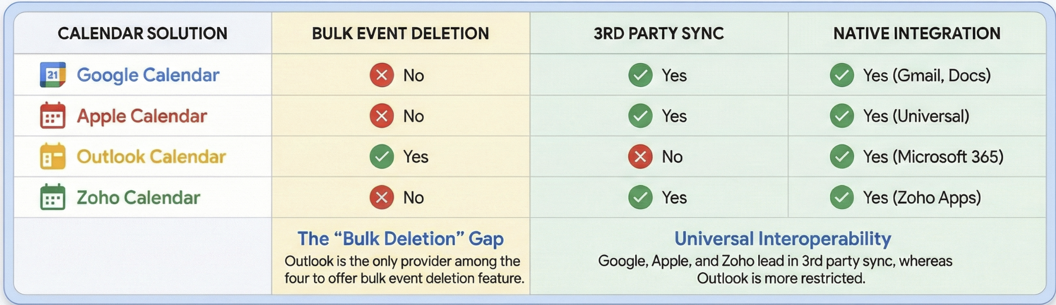
Comparing Google, Apple, Zoho, and Outlook calendars, I focused on functional capabilities like bulk management and 3rd party interoperability, highlighting how each tool anchors into its respective software ecosystem.
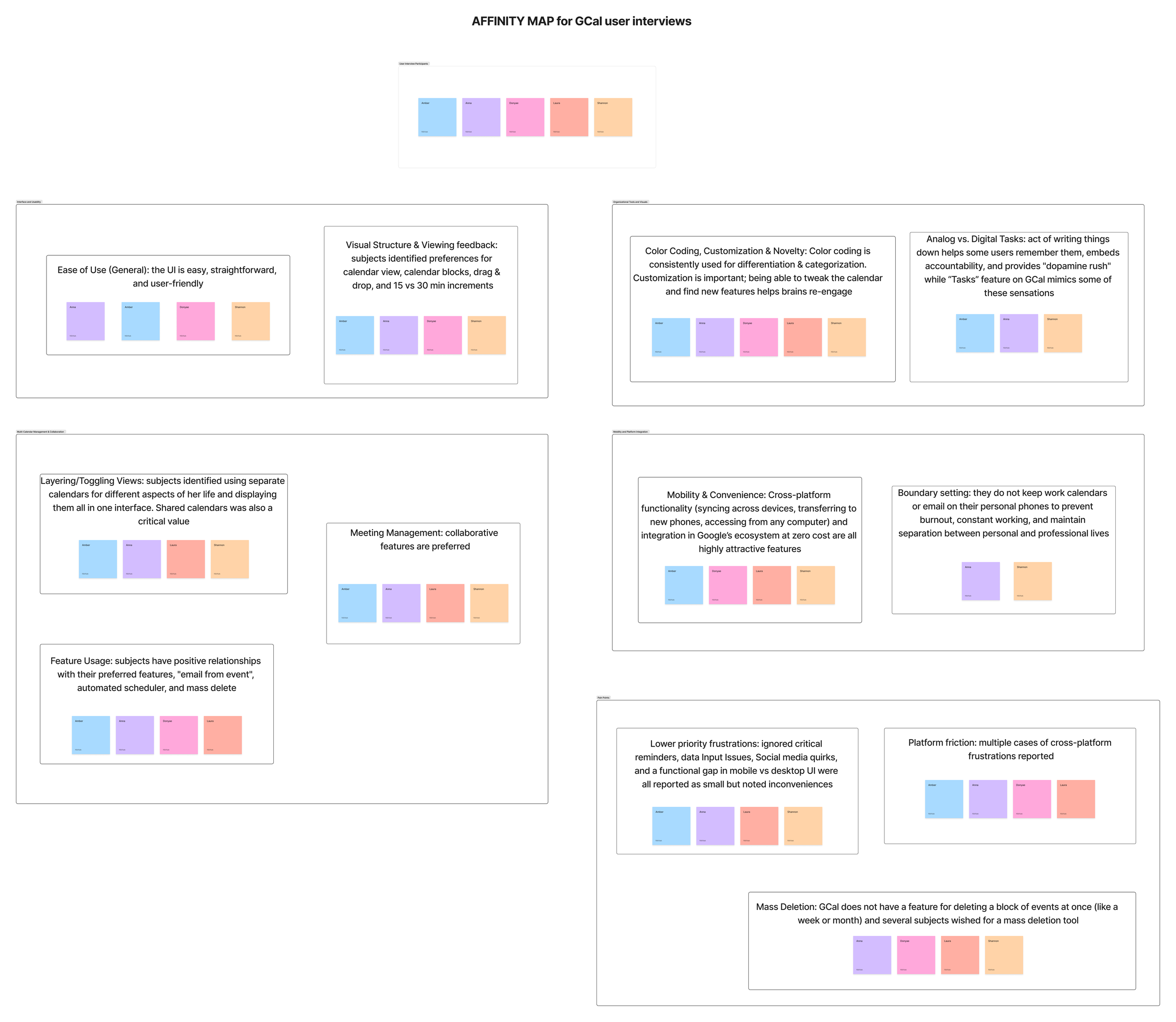
User interviews reveal several key findings about user interaction with Google Calendar and highlight significant opportunities to expand its capabilities.
01
calendar usage & preference
02
technical and set-up details

03
feature utilization

Participants: 5 interviewees, representing a diverse range of ages (32-46), demographics, and professional backgrounds, including project management in biotech, health services research, writing, and tech support.
While our subjects were encouraged to share as much as they felt comfortable about calendaring process, I focused on the following topics:
04
unfulfilled needs and pain points
05
unexpected discoveries and desires
Interview insights:

● A significant finding is that three out of five interviewees identify as neurodivergent with ADHD. This heavily influences their calendar use, often leading to a need for external organization, visual cues, and specific features to manage focus, memory, and task completion.
● Many users struggle with work-life balance and actively seek to maintain boundaries between professional and personal life, sometimes resorting to separate devices or strict non-engagement with work calendars at home.
The challenges of information overload and balancing personal vs professional needs with also suggest opportunities: design interventions that integrate intelligent filtering into mass deletion, allowing users to specify criteria such as event color, type (e.g., "ignore all doctor's appointments"), or recurrence status (one-off vs. series) when clearing events.
Feedback was organized into the following headings:
Interface and Usability
Organizational Tools and Visuals
Multi-Calendar Management & Collaboration
Mobility and Platform Integration
Differing priorities, identities, and values significantly influenced digital calendaring needs for each of the subjects, with mobility, accessibility, and intuitive UI emerging as common considerations.
Through user interviews I developed a primary persona to represent our key demographic, which I call “The Organizer”
Pain Points:
Lack of Mass Event Management: The calendar lacks a function to mass delete multiple, one-off events within a specified timeframe (e.g., clearing a week for vacation), requiring users to delete each entry individually.
Inconsistent User Experience: There is a lack of feature parity and a consistent interface between the desktop and mobile versions of the application.
Poor Cross-Platform Interoperability: Users are highly frustrated by the inability to seamlessly sync or view free/busy times with other major calendar systems, which forces manual scheduling and reliance on third-party tools.
Frustrations with Smart Features: Users experience issues with the auto-population of event details (e.g., defaulting to old dates instead of the current one)
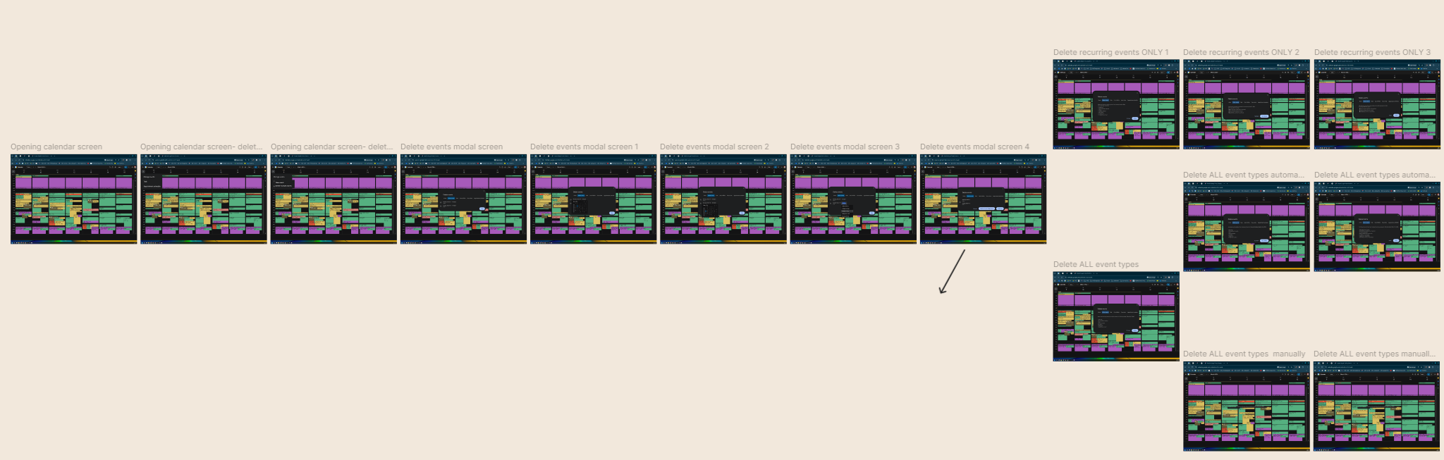
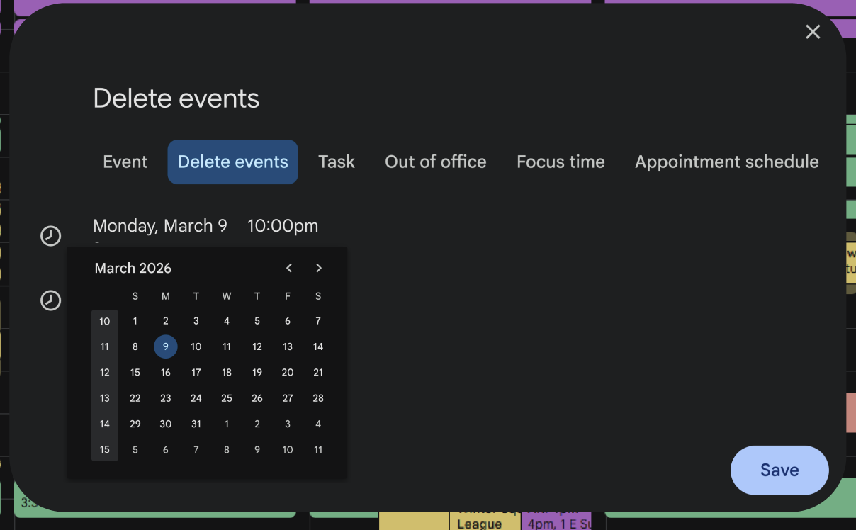
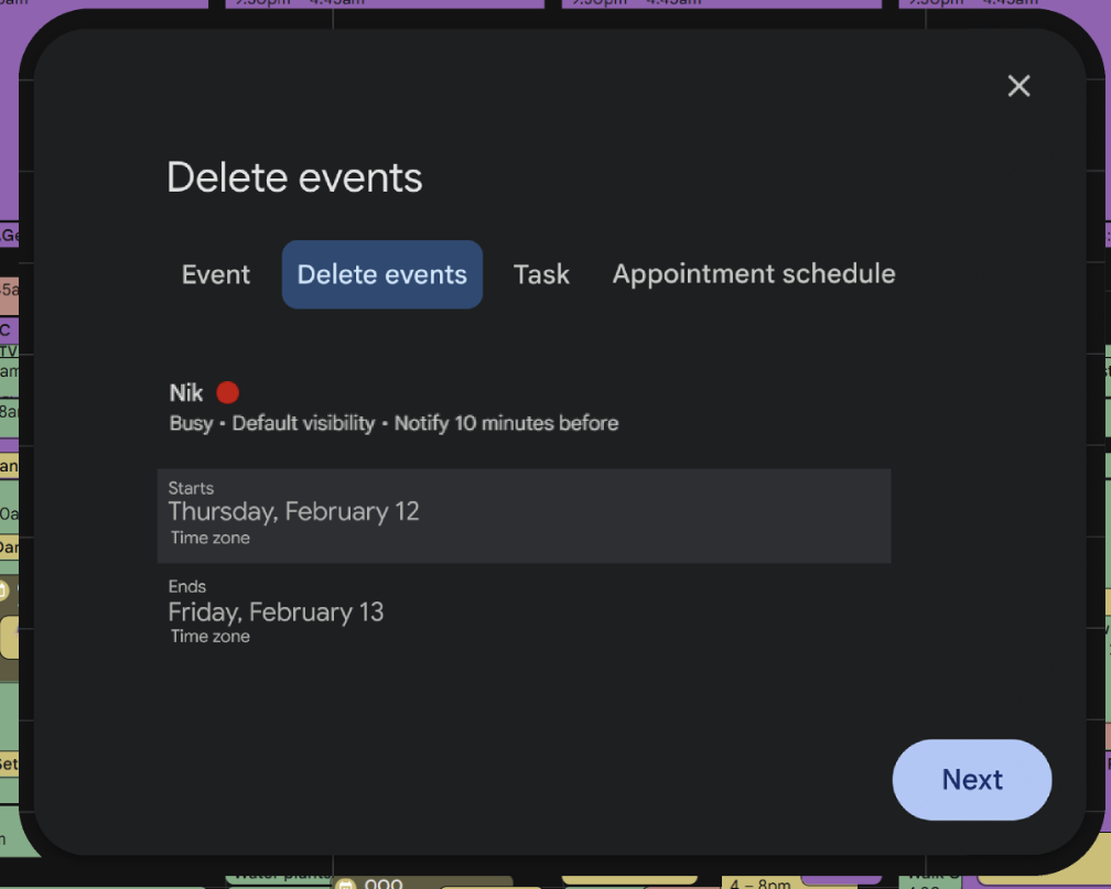
I aimed to address the first of these pain points through a defined user flow.
User Flow: navigating from the opening page to successfully cleaning a block of events
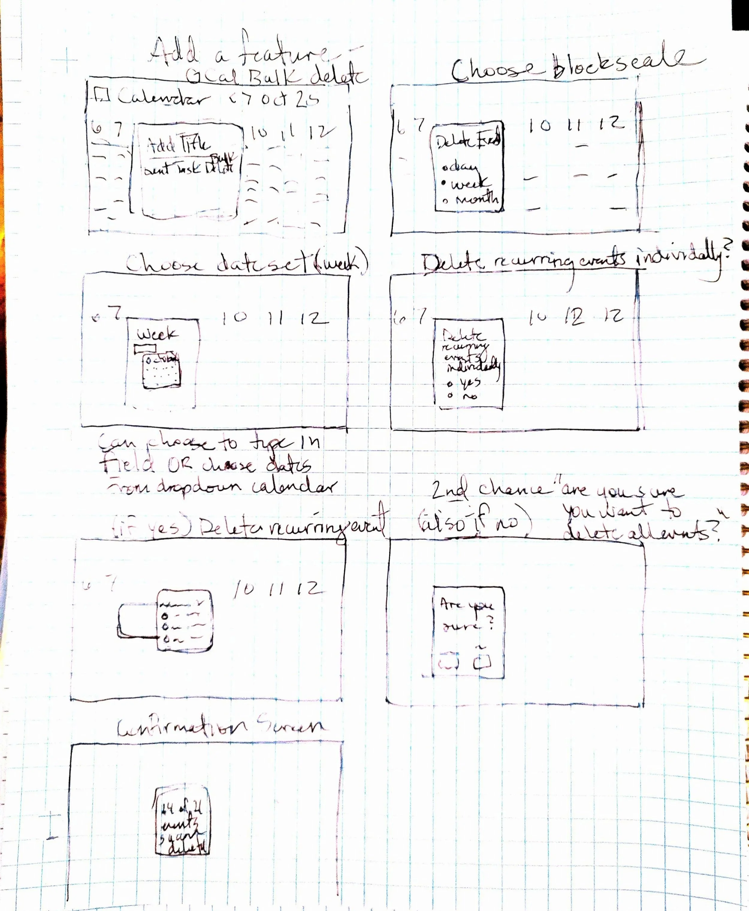
I began by prototyping at the most essential level, first sketching, then developing basic wireframes, and developing a more dynamic wireframe flow to support and empower my user to easily refine their calendar.
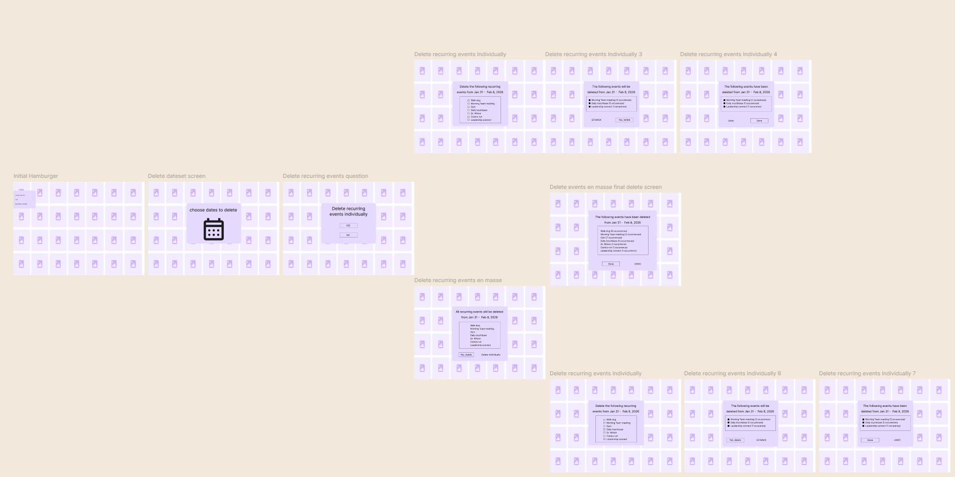
For the first mid-fidelity wireframe flow, I broke out the interaction to have two variable options: deleting events individually or deleting events en masse.
For my first round of usability testing, I duplicated my mid-fidelity wireframes exactly, including the two breakout flows.
I embarked on some interactive tree testing to run through the interaction flow and preempt any larger issues that might arise during final usability testing.
Users responded positively, but there was room to improve the UI…
Menu Structure:
Found "New event" to be counterintuitive under the "manage events" heading, especially since event creation is available through the plus symbol or clicking the calendar grid.
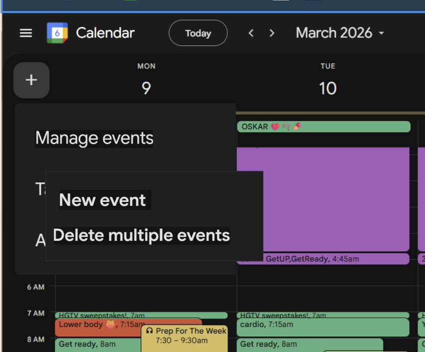
BEFORE
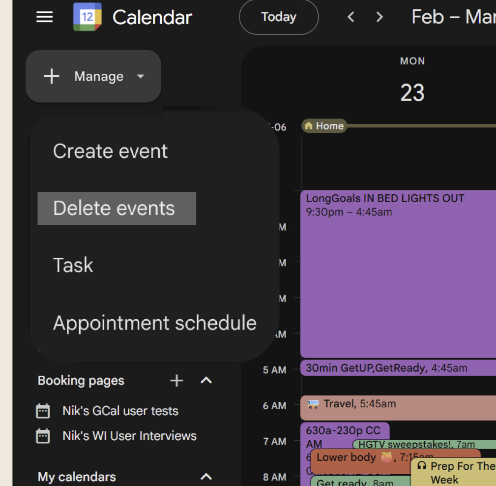
AFTER
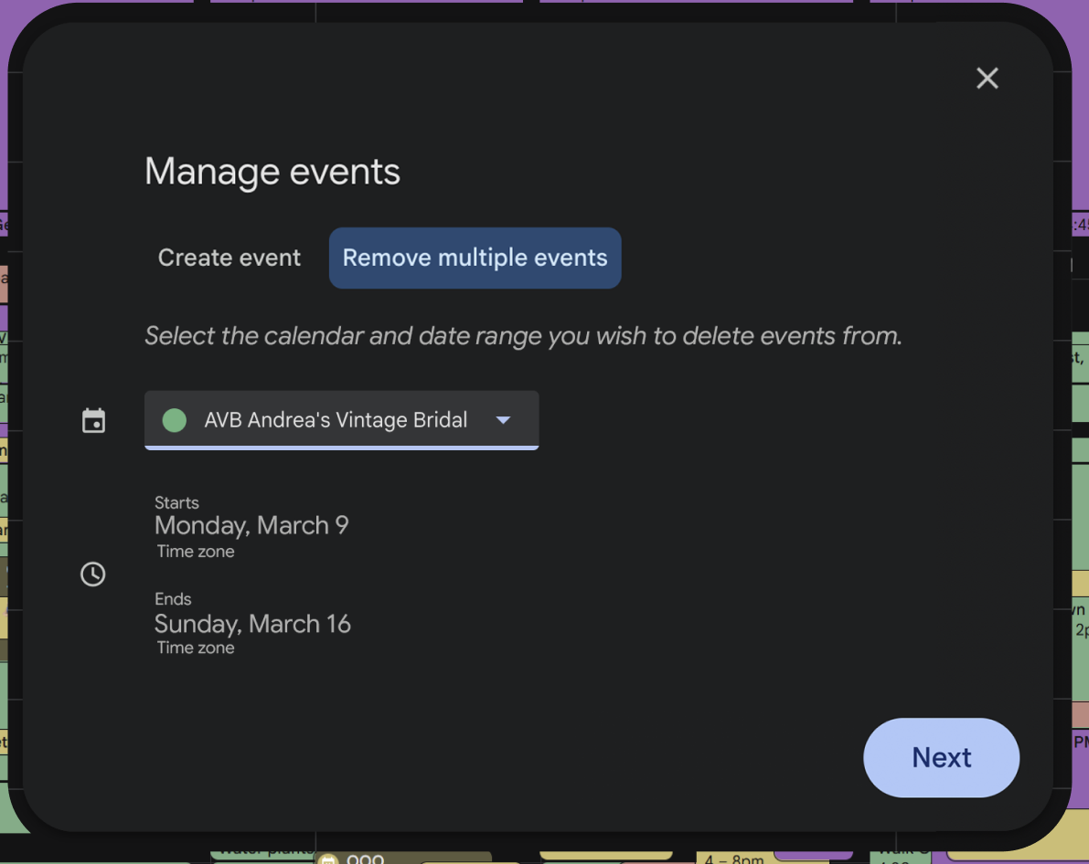
Calendar Omission:
I identified a crucial omission of a step for the user to select which calendar they are deleting events from, as the calendar view can show multiple calendars at once.
BEFORE
AFTER
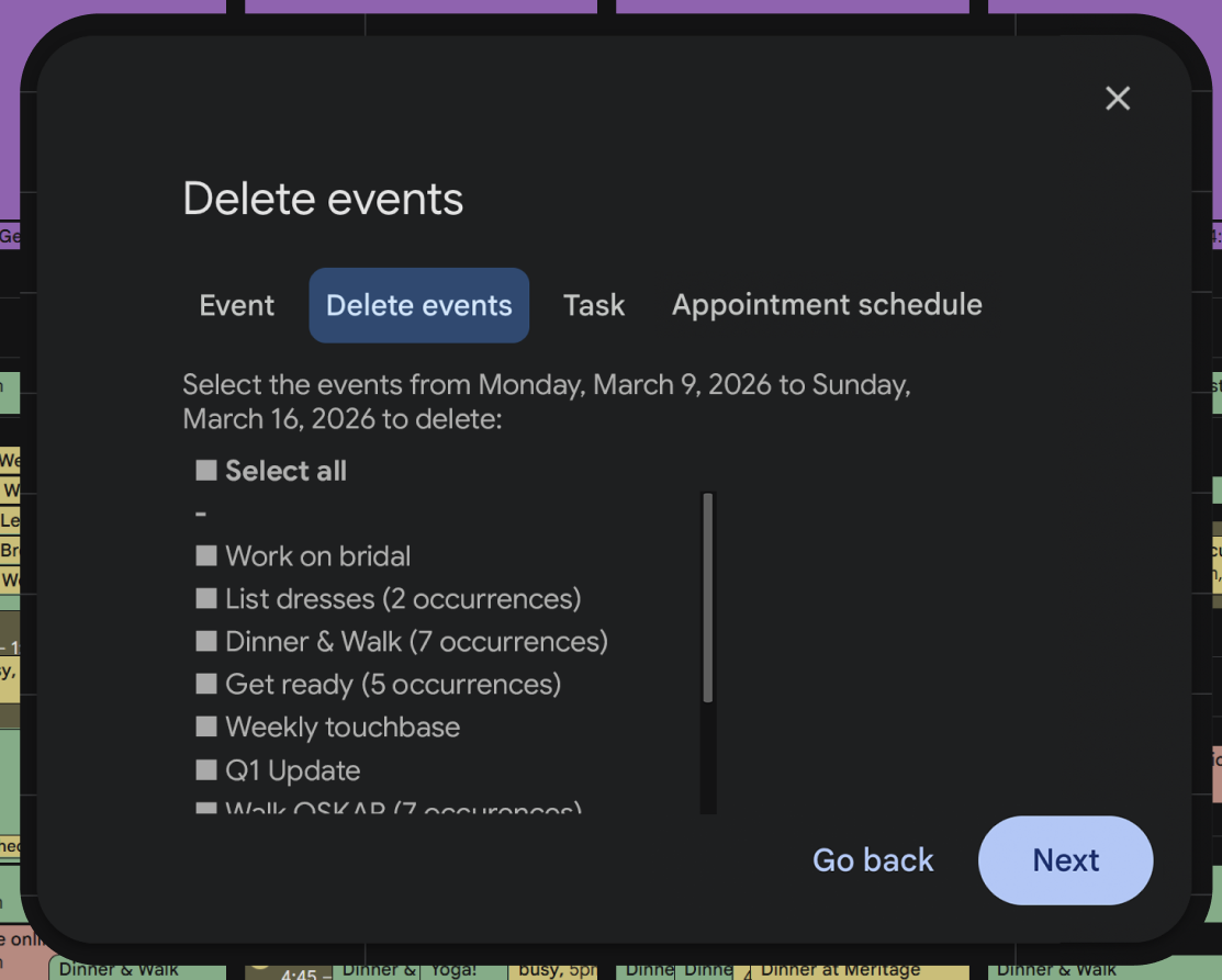
In my 2nd iteration of High-Fidelity wireframes, I reduced the feature to a single flow, eliminating the options of multiple vs single events and incorporating them into a single modal

I then embarked on usability testing through four basic task flows, observing 5 users as they interacted with my product…
I tested the concept with 5 participants who had experience with the administrative requirements of Google calendar, and were familiar with the ecosystem. However, critical feedback focused on the clarity of the UI design- and it turns out all four out of five of my users are neurodivergent! Accessibility and flow organization became top priorities.
Further Iterations: versions 3, 4, and 5
AFTER
AFTER
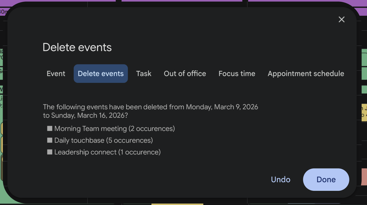
Evolution in Iteration 3: Date Range Clarity
Suggested adding a visual representation of time, a "brick of space" to show the selected range, and a signpost to clearly indicate whether the user is setting the start or end date.
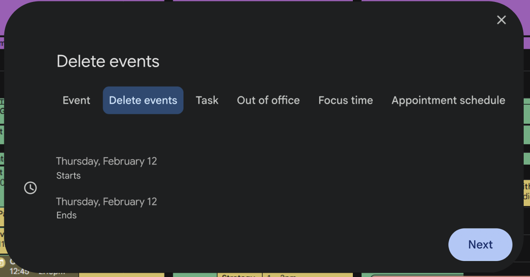
Evolution in Iteration 3: Final Confirmation Screen
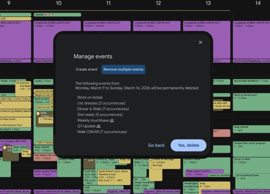
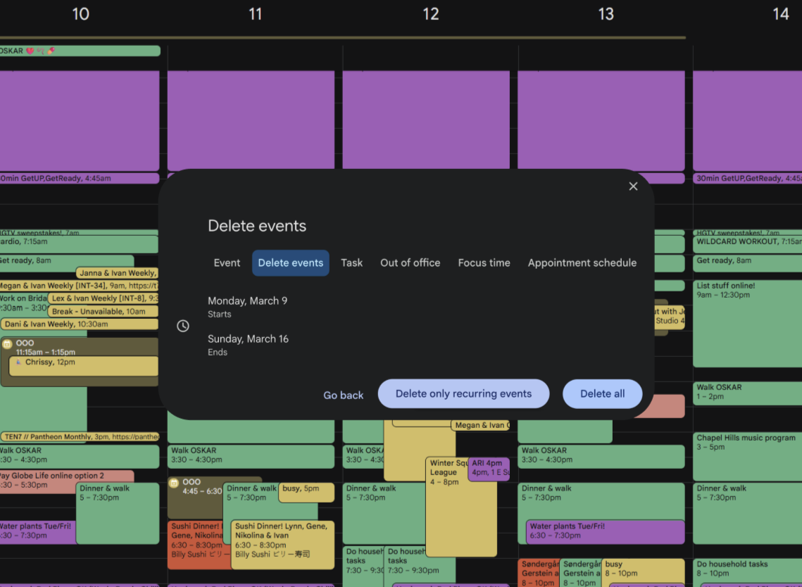
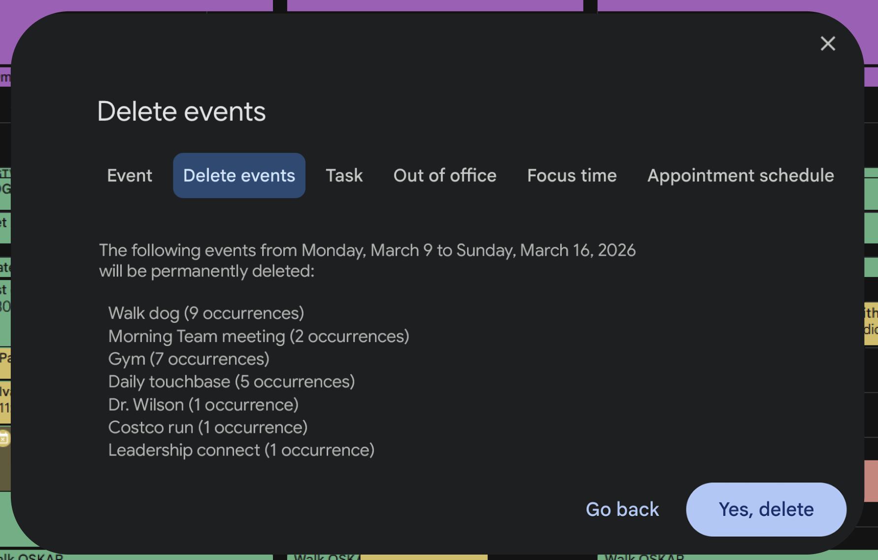
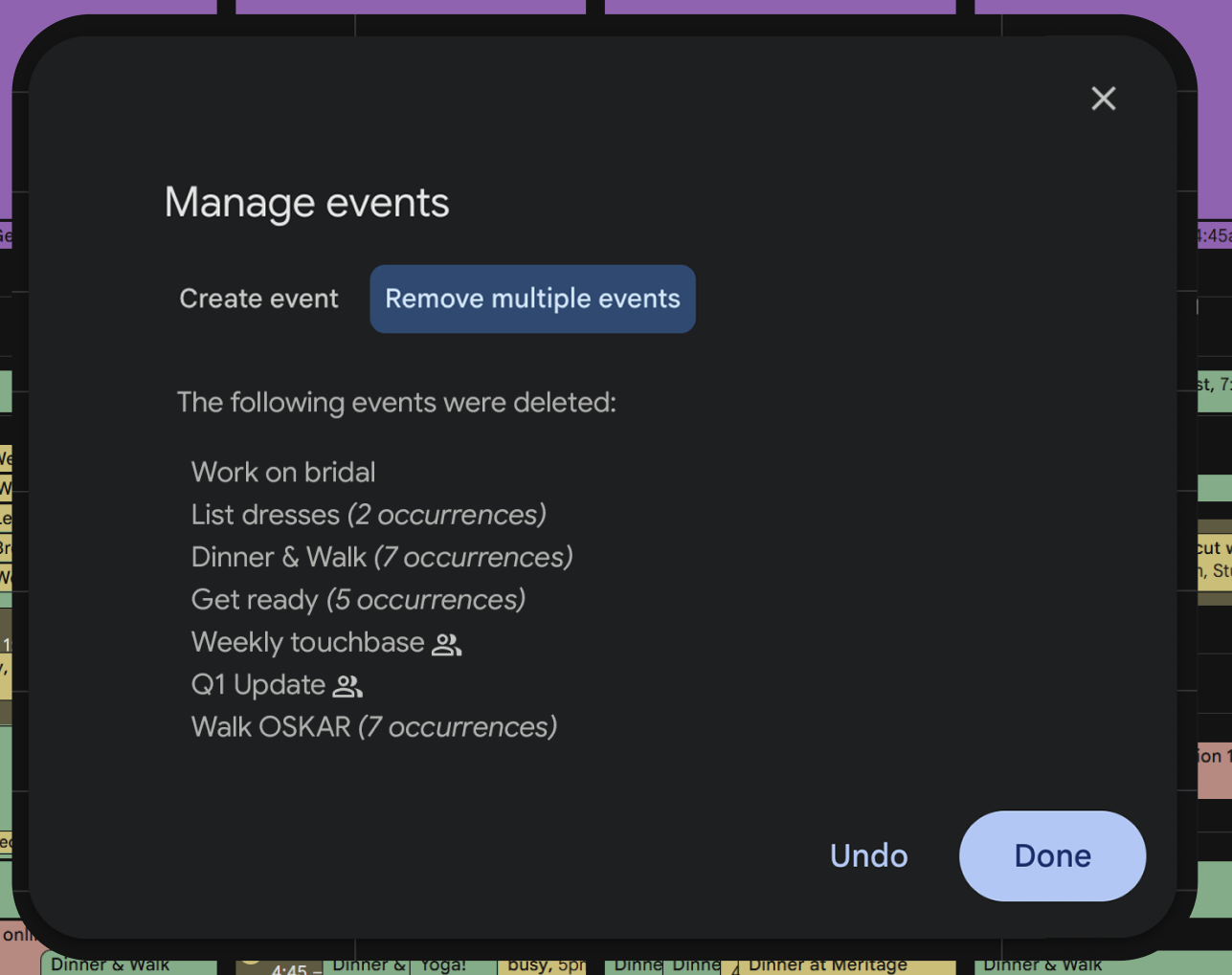
Recommended minimizing the final confirmation screen to only show a concise statement of the impact, such as "39 events will be permanently deleted," instead of listing all the selected events.
BEFORE
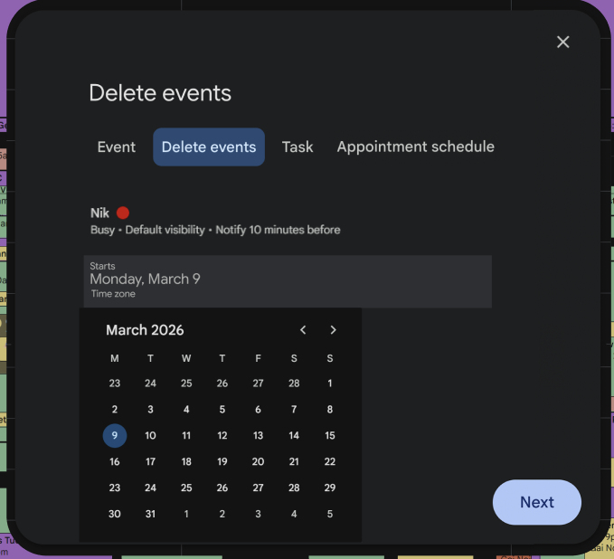
Evolution in Iteration 4: Event Deletion modal
Multiple users suggested the redesign of the primary modal to eliminate “creation” features and only focus on “event” features, specifically deletion, as the convention ultimately falls under acts of destruction, and therefore justified an alternative UI pattern.
BEFORE
AFTER
AFTER
BEFORE
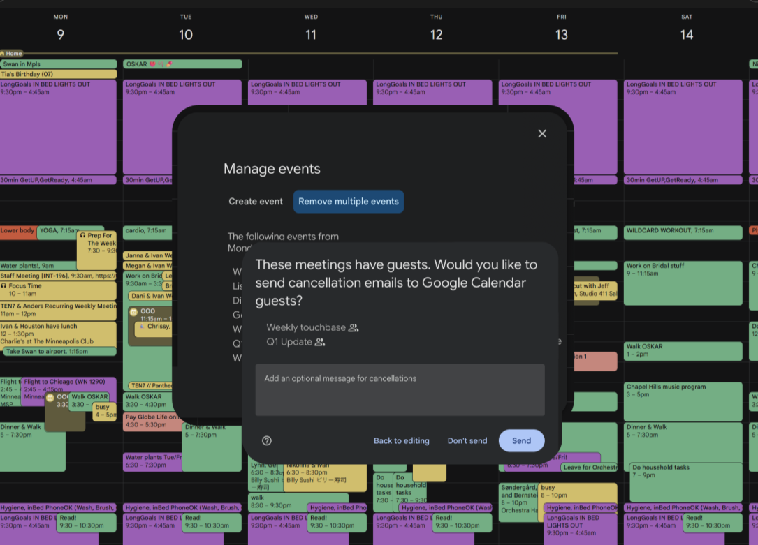
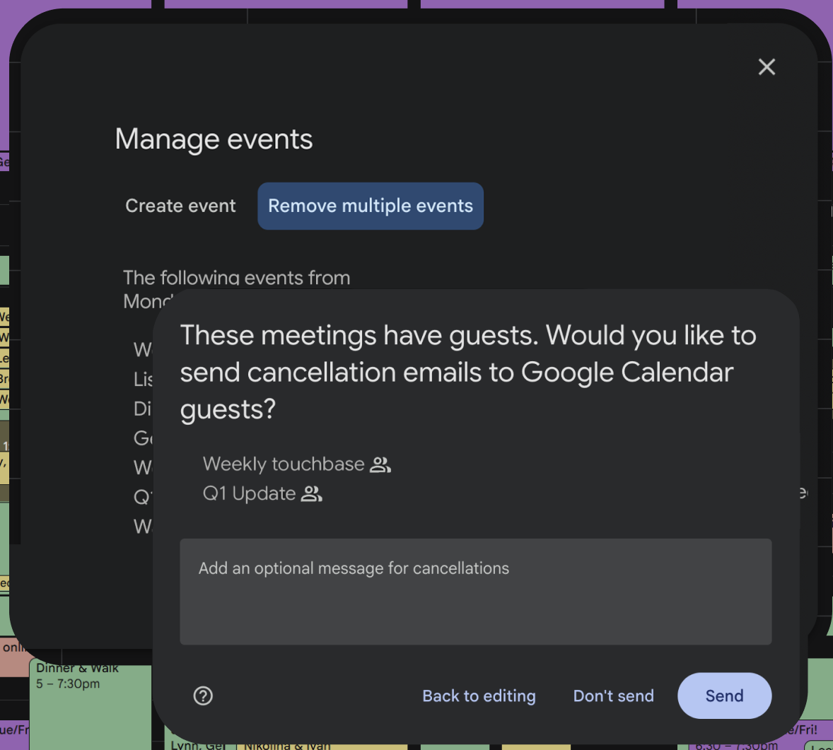
Evolution in Iteration 4: Away message opportunity
Social Protocol was reported as a required function. Deleting an event is a social action, not just a data action. Users pointed out the critical need to notify attendees (cancellation emails) or set "Out of Office" messages.
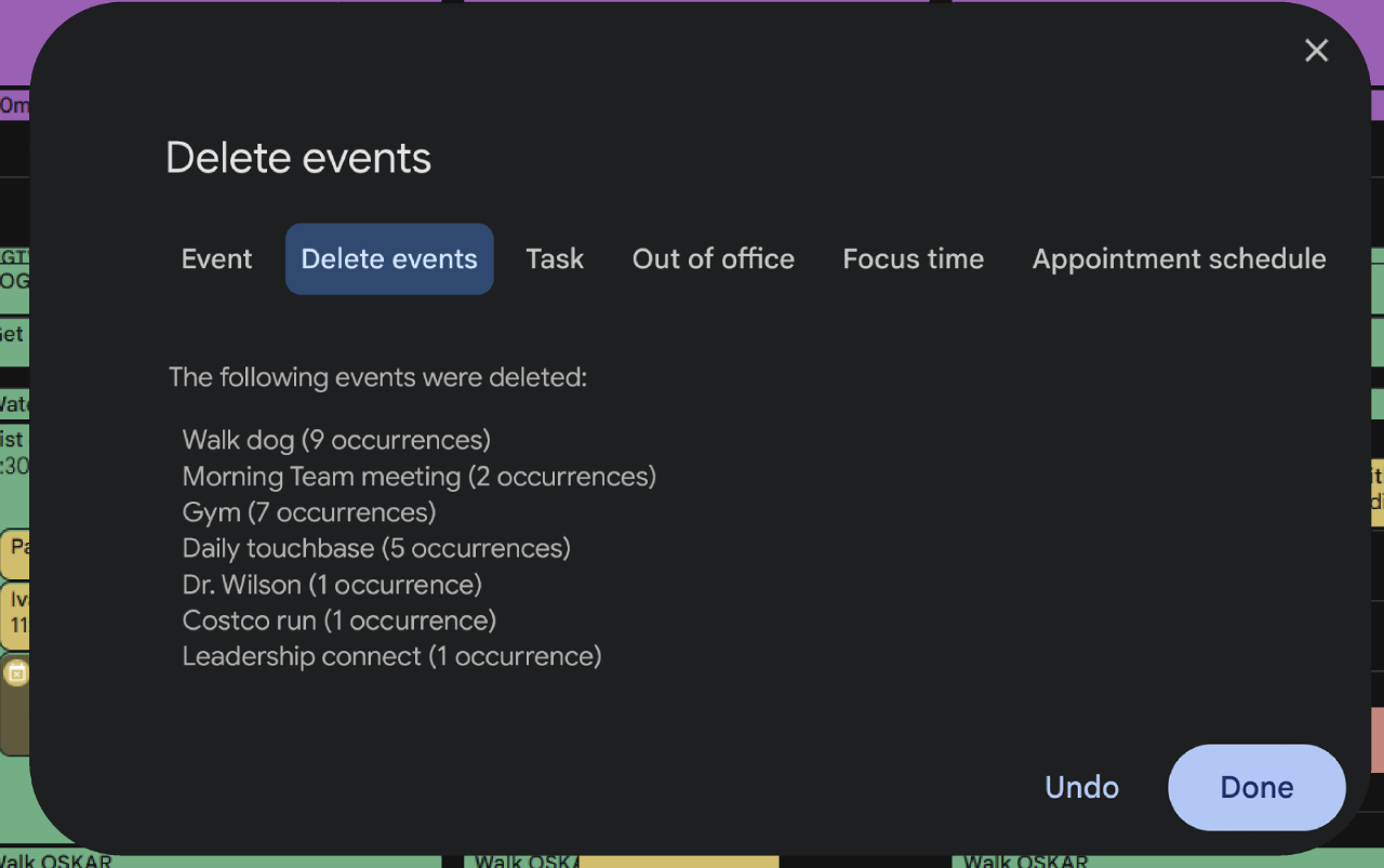
Evolution in Iteration 5: Safety is Paramount:
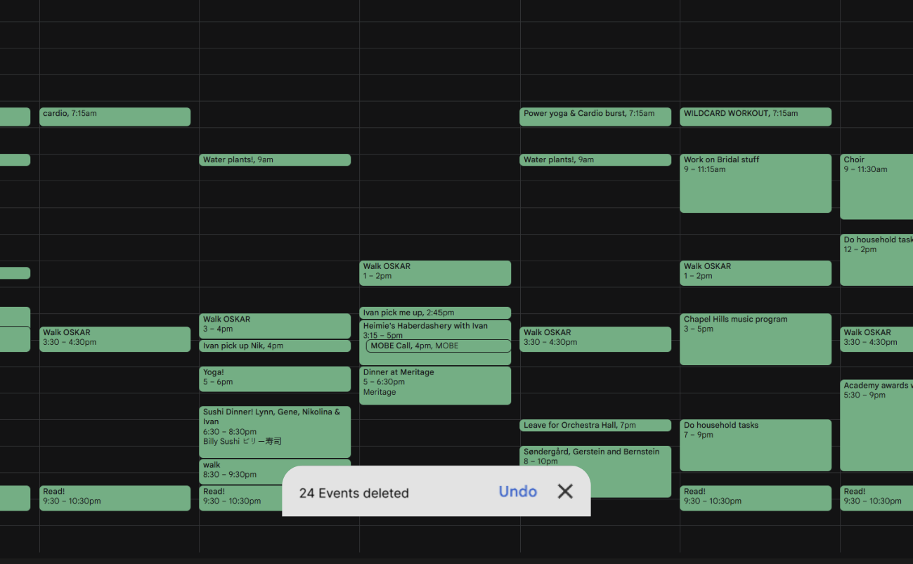
Users are anxious about the finality of bulk deletion. After removing multiple fail-safes, including the "Am I sure?" confirmation, I returned this secondary fail-safe screen followed by the "undo" toast notifications.
BEFORE
AFTER
BEFORE
AFTER
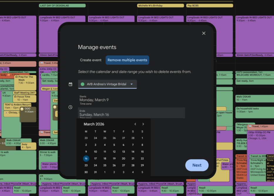
Google Calendar feature: bulk event deletion
Final User Flow
In the final design, I streamlined my user’s needs and created a flow that was seamless and buoyant.
Interactive Prototype:
Google Calendar delete bulk events
Click below:
Reflection:
This project clarified my professional identity within the UX field; while my peers lean heavily into UI, my strengths and interests lie in User Research and Qualitative Analysis. I love discovering people’s stories, learning how their experiences augments or challenges their relationships with a given tool, and then working to implement that feedback into improving the tool. That said, I enjoyed working within a closed ecosystem; as a UI project, it was challenging in a fresh, exciting way to distill flow from design.
Additionally, the project taught me the difficulty of editing in design, realizing that simplifying a flow is often harder than adding to it, and often, that the shorter/smaller the thing, the more work went into it.