

an inclusive, innovative space to reduce the stress of planning a wedding
case study · 7 min read


the problem:
planning a wedding is overwhelming- and sometimes alienating.
many couples planning weddings are interested in making budget-friendly, sustainable, inclusive, and accessible choices whenever possible. however, this planning can be challenging or time-consuming.
furthermore, the spaces traditionally created to plan weddings can be exclusive, alienating, and overwhelming.
For this case study, I wondered: how do we make wedding planning fun, validating, and less stressful?
Process
User research and synthesis, ideation, prototyping, interaction, usability testing
My Role
UX/UI designer
Tools
Figma, Figjam, Miro, Mural, Optimal, Google Workspace
Duration
12 weeks
Feb-May 2024
The goal:
Determine if non-traditional couples planning a wedding would be more likely to make inclusive, sustainable vendor choices if there was an intentional “goldilocks” space that focused on finding just the right vendors using taxonomic hierarchy.
and make it fun!
a beautiful, relatable space that encourages visual “grazing”
…so couples planning a wedding can make inclusive, sustainable vendor choices in an intentional “goldilocks” space that focuses on finding just the right vendors using taxonomic hierarchy.
innovative tools that borrow from the worlds of project management and gameplay
seeing familiar tools through a fresh lens, our couples are supported through dynamic wedding planning resources, and empowered to create an event that truly reflects their identity.
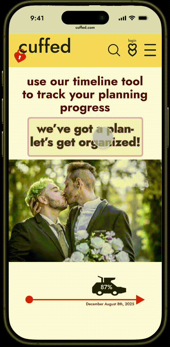
table of contents:
Research:
Lifecycle industries are in a never-ending growth spurt: people will always be getting married! but as someone who works in the wedding industry as a sustainable vendor, I hear endlessly how overwhelmed my clients are. there must be better tools!
I used the following research methods to generate a strategy and develop brand identity:
● competitive analysis
● user interviews
● affinity mapping
● exploring opportunities through POV & HMW
statements
● developing user personas

Competitive analysis findings
While some of these businesses are young upstarts and others are established veterans, all of them have certain strengths; however, none of them offer hierarchical taxonomy searching (by sustainable, women-owned, BIPOC-owneed, GLBTQIA-owned, accessible, etc) which creates noted opportunities in the industry.
Aimed at moderately less mainstream couples, offers free wedding planning tools including registries and a website builder tool, as well as comprehensive vendor directory (excludes apparel).
National

Aimed at more mainstream couples, offers free, accessible wedding planning tools and a vendor database of 167,000 vendors, the largest in the U.S. (includes apparel).
National

Aimed at less mainstream couples, MN-based sustainable event planner that also offers local directory of sustainable wedding resources local to the Midwest (includes apparel).
Local

Aimed at more mainstream couples, offers resources for couples planning their weddings, including a magazine, a website with wedding vendor profiles and inspiration, and local planning events.
Local

User Interviews:
01
resources available to fund/create their wedding
02
apps/websites used for planning their wedding

03
how they stayed organized while planning their wedding

5 remote interviews, all recorded and transcribed, provided direct insight into the motivations and values of our non-traditional couples as each plan(ned) their wedding. Every subject planned a non-traditional wedding in the last two years or are currently planning their wedding. They represent a broad array of demographic and geographic backgrounds, emphasizing as much diversity as possible in our sample.
While our subjects were encouraged to share as much as they felt comfortable about the wedding planning process, I focused on the following questions:
04
values and requirements driving their wedding planning
05
unexpected discoveries they had while planning their wedding
Synthesis:
Interview insights:
Our user is looking to find the balance between prioritizing a ceremony and reception that is unique, meaningful, comfortable, and reflects the values and history of our subjects, while also conforming to budgetary and familial expectations.


There was intention around achieving a specific aesthetic while being budget-conscious, prioritizing sustainability, DIY philosophy, and reuse/upcycling in their choices.
Our subjects focused on having a unique and special ceremony while ensuring that all their guests felt appreciated and included, especially those who traveled or have specialized accessibility needs.
The challenges of information overload and balancing personal vision with external pressures also suggest opportunities: design interventions that streamline the planning process and empower couples to make informed decisions that reflect their unique needs and values.
Feedback was organized into the following headings:
Budget Consciousness
Authenticity through DIY & personal networks
Guest Experience
Inclusivity
Intimacy/Scale
Differing priorities, identities, and values significantly influenced wedding planning decisions for each of the subjects, with cost and guest list management emerging as common considerations.


Through user interviews I developed personas to represent my primary user; our user identifies as diverse or marginalized, often has access needs, and values transparency in brand identity.


Primary pain points and challenges outlined in the wedding planning process:
difficulty finding niche/specific vendors
overwhelm and information overload
time constraints and executive function struggles
Ideation:
I aimed to address each of these pain points through a separate user flow.
connect users to vendors in a space that is welcoming, exciting, and conducive to trust
Key features:
offer wedding planning tools that meet the needs of any couple (mainstream or otherwise), but are specialized or intentionally inclusive of non-traditional couples with a focus on accessibility
help couples focus on organization who may not have exposure to traditional wedding culture/expectations
also… I was wrong!
I incorrectly assumed my users would prioritize sustainability as important (or more) a consideration than their other values. In fact, their priorities consistently revolved around authenticity, inclusion, and accessibility, with sustainability being a baseline consideration only if and when budget and time allowed (which they often did).
so I knew I needed to address this discovery in the design phase…
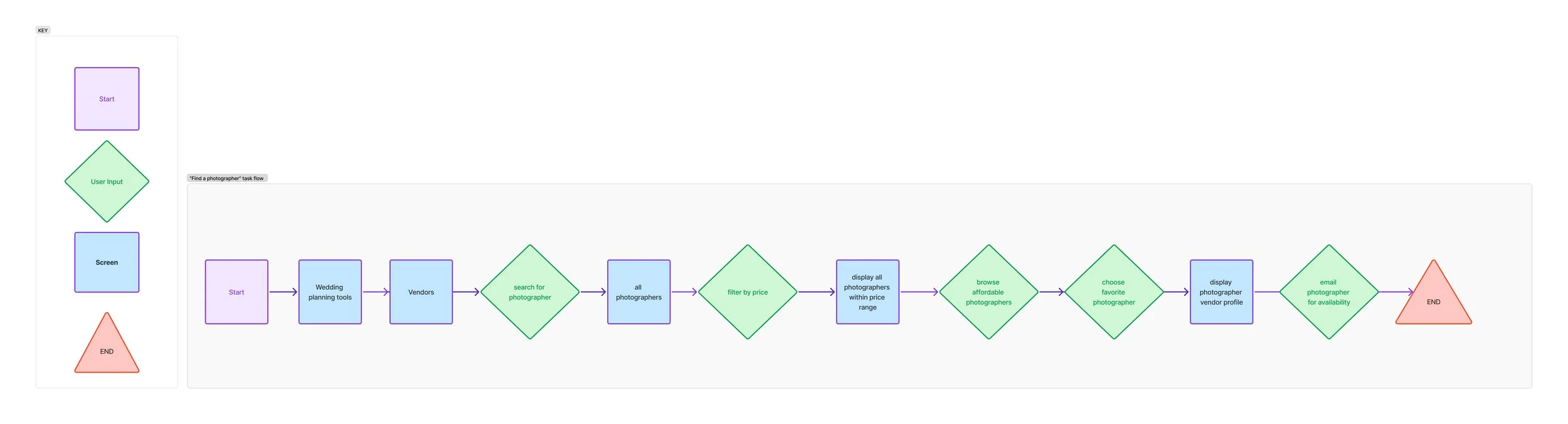
Task Flows & User Flows for cuffed
Effortless wedding planning: Two User-Friendly Methods
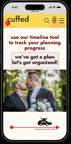
Because the timeline tool felt novel, I knew I needed to also create flows that simplified the process of searching for vendors: users can either follow several different pathways that ultimately lead them to various vendor galleries, or select the timeline tool to begin populating their customizable timeline with their own contents.
User Flow: searching by vendor type, inspiration gallery, or wedding genre

Task Flow: searching for a wedding photographer
Design:
I began by prototyping at the most essential level, first sketching, then developing basic wireframes, and developing a more dynamic wireframe flow

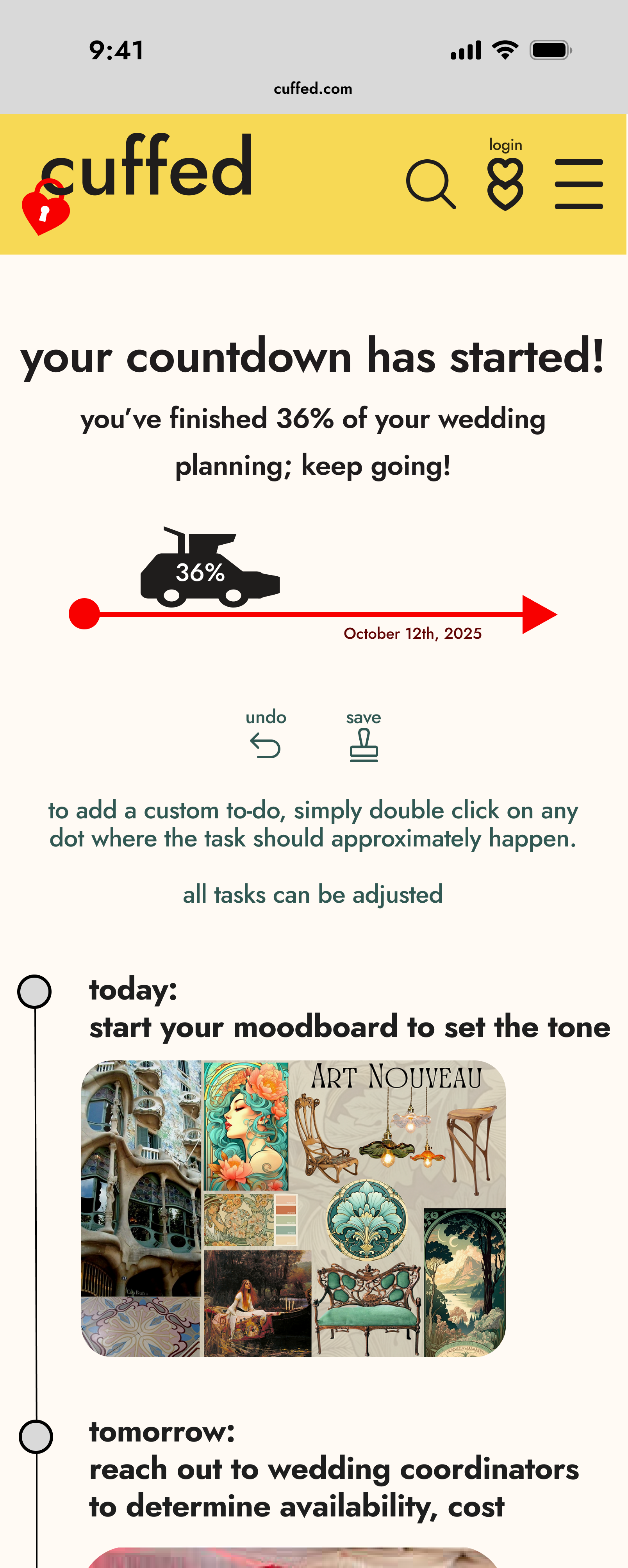
The home page became the main feature, a central point allowing users to keep a pulse on their planning. It served as a central hub for all planning tools, and offered a visual playground for users to explore.
Designing the wireframes revealed how critical it was to make the vendor layouts concise. With options for choosing location, demographics, or social value, there were too many opportunities for cognitive overload. Through several iterations, I condensed the process into a streamlined layout that provided an efficient (and ideally, delightful!) way to sort vendors.
…and I was wrong again!
When I started creating my component library, I was basing my initial designs off a personal interest in making a “pretty” and aesthetically pleasing website; I chose soft colors and leaned into an Art Nouveau aesthetic. Because this initial intention didn’t actually match my user personas and their values/ideology, I ran into a design wall- the aesthetic just wasn't making sense.
BUT, once I stepped back and reassessed my user personas, brand values, and goals, I realized I had been misguided; wedding websites are traditional “pretty” because the assumption is that the user is typically a heteronormative woman, as women traditionally hold the bulk of wedding planning responsibilities; however, my user is not as likely to be a heteronormative woman, so I needed to promote a design that is not binary, heteronormative, nor gendered, necessarily. I changed my entire style card in service to my users, and the design flowed from that point, using my wireframes as guidelines.
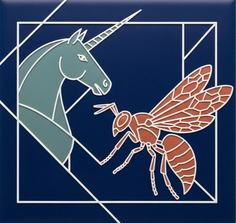
I redesigned the colors, font, and mood board to reflect a kitschy but lean 90's aesthetic. I included a graphic to serve as the archetypal inspiration for the entire overall design, and relied on white space to provide balance.
Creating a vibrant brand identity through gender- neutral retro inspiration
I focused on a subtly cheeky, simple logo design that conveys a fresh, relevant attitude.
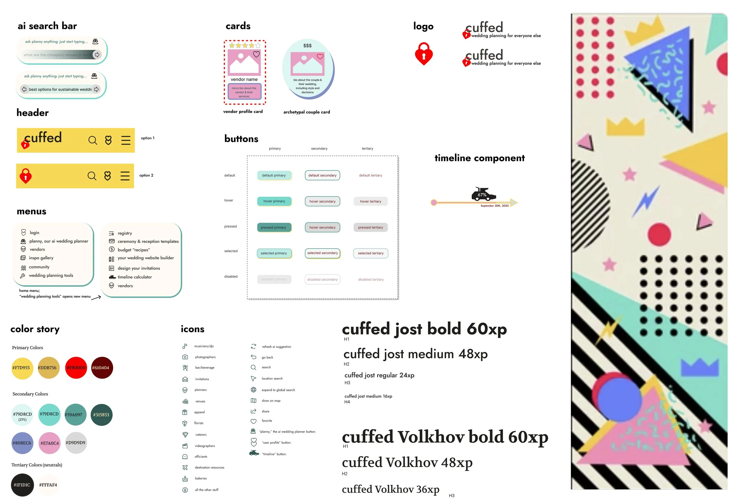
cuffed boasts colors and thematic elements inspired by late 80’s/early 90’s aesthetic, a strong graphic statement, bold colors, minimalist typeface, and fun icons/visuals that reflect a generation (or two) raised by videogames, cartoons, and iconic characters. It's intentionally not “pretty”, but fun and cool- and embraces the gamification of wedding planning while giving our users space to breathe, relax, and settle into wedding planning through the lens of delight.
Hi-Fi wireframes: round 1


here, I embarked on usability testing through four basic task flows, observing 5 users as they interacted with my product
Users responded positively, but there was room to improve the UI.
I tested the concept with 5 participants who had experienced wedding planning. All of my participants liked the idea of a simple “block system” of vendor sorting and a chronological timeline tool that sends notification. However, critical feedback focused on the clarity of the UI design- and it turns out all five of my users are neurodivergent!
features that worked:
were reported to be accessible and consistent in terms of sizing and tone, which contributed to a purposeful feel.
The layout of several sections were found to be compelling and clean, and the overall aesthetic was appreciated by every user, who offered compliments on the design, unprompted.
reported user experience issues:
All five users suggested various fixes to address accessibility pain points (buttons were either not “buttony” enough, or TOO “buttony” and disorienting).
Two users requested that the homepage better clarify cuffed’s social networking integration and the range of its ai wedding planner.
Final Design:
I undertook a design that streamlined my user’s needs, looked beautiful, and created an environment that users want to “play” in.


gamification of wedding planning was also a feature; users requested a variety of tools in a clean presentation.


cuffed:
final user flows
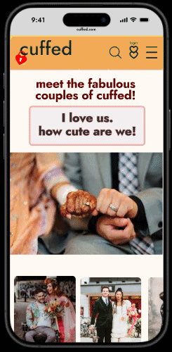
Vendor Search
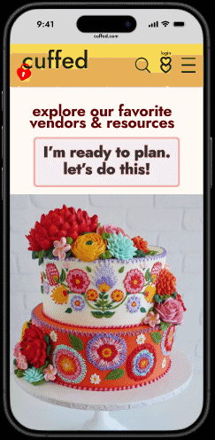
Inspirational couples search
Customizable timeline tracker tool
Interactive Prototype:
The cuffed experience
Wedding planning for everyone else.
Click below:
Reflection:
Future Innovations and Growth Opportunities
Bringing cuffed to life was a deeply rewarding experience. I was pleased to see where business tools and user needs intersect to support passionate couples as they plan their weddings. It was exciting to gather user research and implement it in real time; fostering smart product design to empower couples to create unique, meaningful experiences that reflect themselves and their communities.
It was rewarding to think about the identity of my product through branding and tone and generating a space as unique as my users. Looking forward, I’m considering what other elements might make the difference between a usable space and a user-joyful space; I want cuffed to be irresistible, and make people feel good just to be there.
I’m curious how I can make the process of wedding planning more streamlined for users; with more time, I would like to explore how cuffed might serve the landscape of both couples and wedding planners, perhaps connecting planners with couples in a marketplace for hourly consults. There also presents opportunities to cultivate a social network-style space, where couples who have recently been married can socialize with couples still planning; to share tips, hacks, and perhaps even participate in a trade/buy-nothing marketplace.
Overall, there is considerable untapped potential for growth in non-traditional wedding planning, and the opportunities continue to present themselves as our users grow, evolve, and develop in social and environmental awareness.