

Designing a Digital Sanctuary for Inclusive Tattooing
case study · 6 min read
Context and Conflict
Tattooing is intimate, permanent, and painful.
The Artist: Wednesday is a new tattoo artist without an extensive client history or visual portfolio.
The Client: Traditional shops often feel unsafe or intimidating to queer and neurodivergent clients.
The Mission: Design a visual portfolio that establishes immediate trust and credibility for a new tattoo artist who lacks an extensive history or clientele.
Process
User research and synthesis, ideation, prototyping, interaction, usability testing
My Role
UX/UI designer
Tools
Figma, Figjam, Miro, Mural, Optimal, Google Workspace
Duration
12 weeks
Sep 2025 - Feb 2026
The goal:
Bridge the trust gap before the client ever enters the studio by leveraging Wednesday’s diverse history and education.
Design a portfolio that counteracts consumer trepidation of new or inexperienced artists by demonstrating professionalism, and to screen for aesthetics and value-aligned clients, ensuring a safe space for queer, neurodivergent, and marginalized identities.
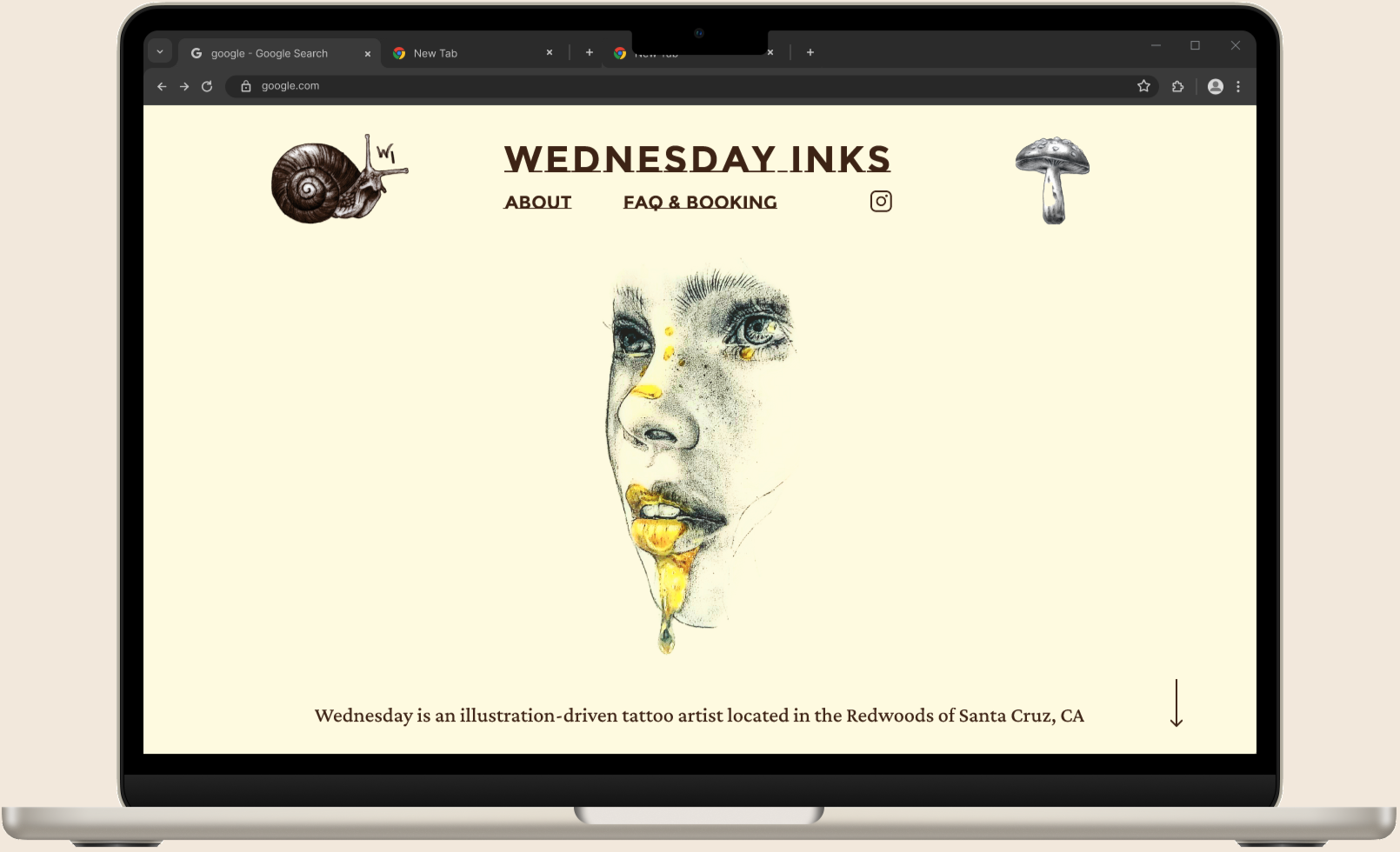
An Artist’s Digital Sanctuary
Transparency + Accommodation = Trust
Transparency: Explicit pricing and process to reduce anxiety.
Accommodation & Inclusivity: Clearly and overtly emphasizing ‘Safe Space’ policies.
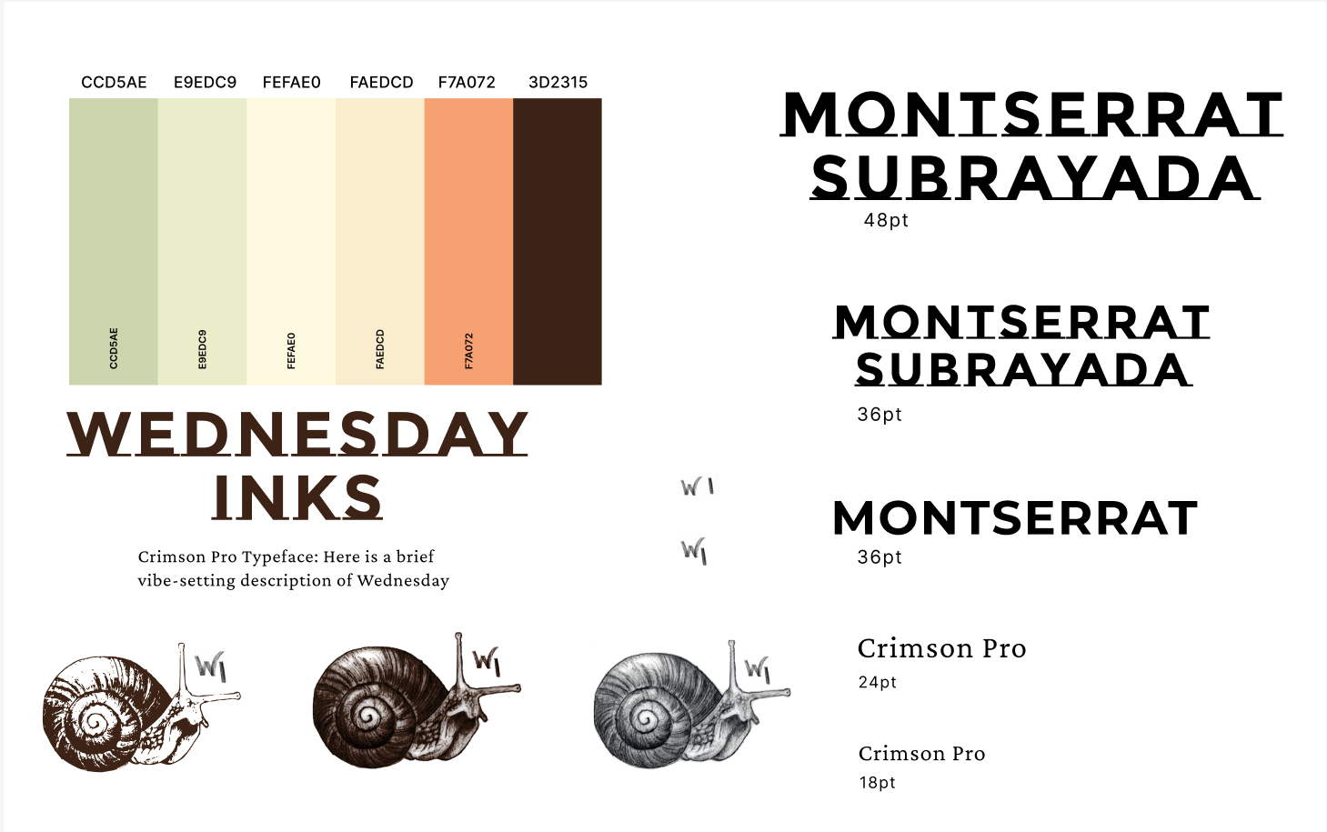
Calm UI: Design mirrors the actual studio and evokes warmth and calm, avoiding sensory overload or ‘clinical’ feel.
These elements combine to generate faith in the brand, building trust along the way.
a fresh approach that borrows from the world of artist and designers portfolios
seeing classic tools through a modern lens, our client has a space to explore and acclimatize to Wednesday’s aesthetic.
Research:
It can be tricky to establish immediate trust and credibility for a new tattoo artist who lacks an extensive history or clientele. The design of this portfolio needed to counteract consumer fear of “new or sloppy artists” by demonstrating professionalism and hygiene. Additionally, the site needed to serve as a screen for value-aligned clients, ensuring a safe space for queer, neurodivergent, and marginalized identities.
I used the following research methods to generate a strategy and develop brand identity:
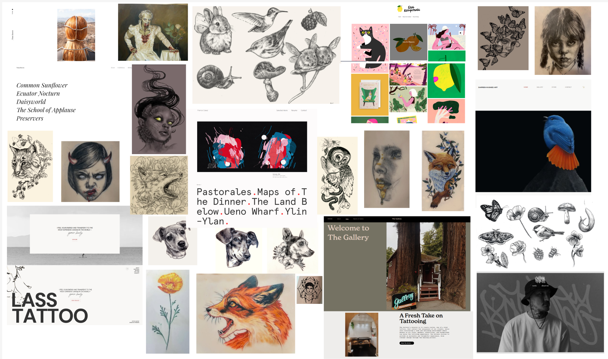
● competitive analysis
● user interviews
● affinity mapping
● exploring opportunities through POV & HMW statements
● developing user personas
Competitive analysis findings
Traditional Studios |
Our Solution |
|
|---|---|---|
Focus |
Traditional Styles |
Niche (Botanicals, Fine Line) |
Transparency |
Opaque Pricing |
Clear Pricing & Process |
Inclusivity |
Variable, often unspoken |
Explicit 'Safe Space' Policies |
Digital Experience |
Basic Website, Booking Focus |
Calm UI, Accessibility Focus |
Key Insight: Existing options lack the specific combination of niche focus, radical transparency, and inclusive, calm design found in the proposed digital sanctuary.
User Interviews:
01
Personal Context: I gathered demographic, background, and lifestyle details to explore how personal aspects contribute to creative decisions regarding tattoos.
02
Tattoo History & Motivation: I focused on the user's history with tattoos; how many they have, when they got them, the underlying motivation, and the overall experience.

03
Artist and Studio Selection Criteria: factors involved in choosing an artist and studio, probing for information on trustworthiness, professionalism, portfolio, location, cost, and the artist values.

Participants: 6 women and non-binary individuals with multiple race identities.
Age Range: 30s - 40s.
Key Insight: Tattoos are a method of reclaiming bodily autonomy and healing trauma.
While our subjects were encouraged to share as much as they felt comfortable about the tattoo process, I focused on the following questions:
Synthesizing Goals:
Interview insights:
Safety and Comfort: Physical pillows, breaks, and emotional safety.
Collaboration: An artist who listens, not dictates.
Clarity: Clear expectations on pricing and process.
I found that lack of inclusivity was a baseline dealbreaker for prospective clients: Rejection of hate speech, and a preference for queer/AFAB-run spaces.
Hygiene was non-negotiable as well, including licensing and visible cleanliness.
Another major factor was ‘skill on skin’: an ability to showcase healed work on diverse skin tones, with no raised lines.
But the biggest surprise was the requirement for style matching; the aesthetic and design style an artist presents is typically the first requirement all of my subjects had when sorting through potential tattoo artists.
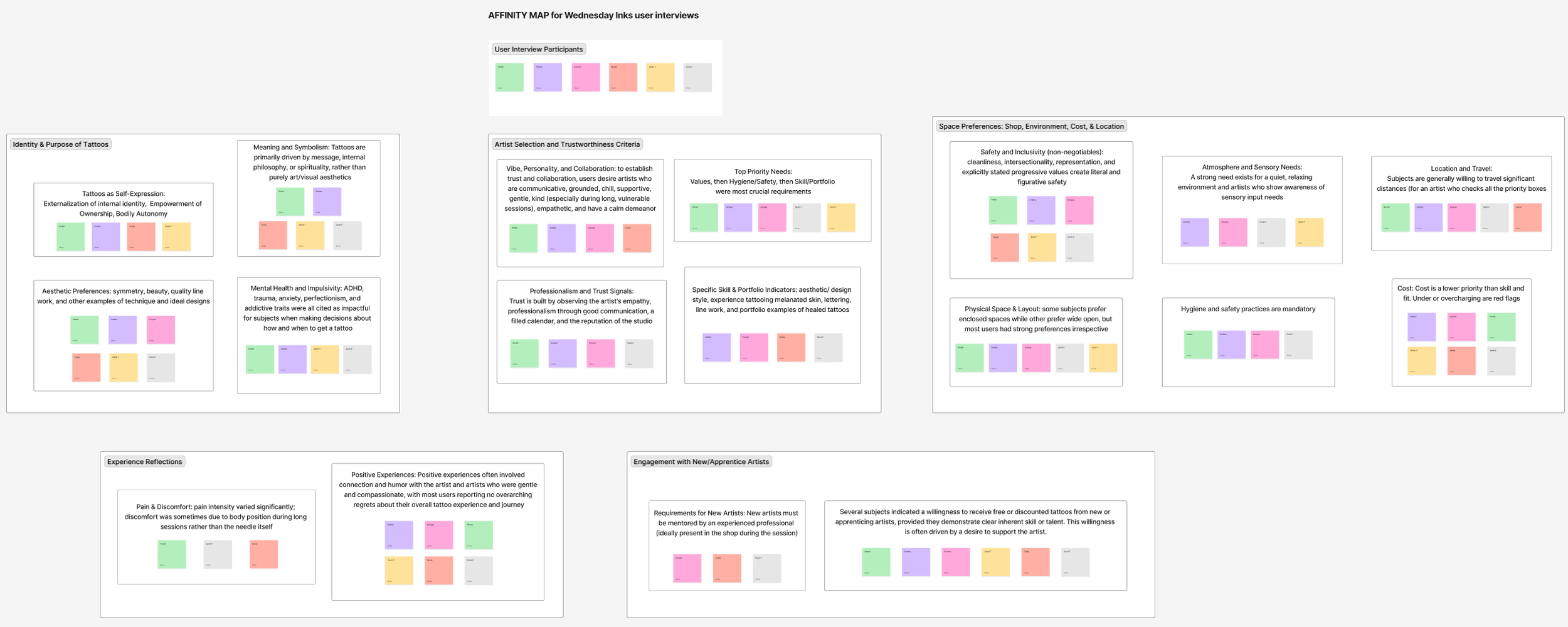
Feedback was organized into the following headings:
Identity & Purpose of Tattoos
Artist’s Values and Trustworthiness Criteria
Experience Reflections
Engagement with New/Apprentice Artists
Differing priorities, identities, and values significantly influenced tattoo planning decisions for each of the subjects, with style and values emerging as common considerations.
Through user interviews I developed two primary personas to represent our key demographics:“The Thinker” and “The Dreamer”:
Pain Points:
Intimidation
The “Frat House” atmosphere of traditional shops
Lack of Representation
Portfolios featuring only white skin or healed photos
Sensory Overload
Loud music, bright lights, lack of privacy
Lack of Transparency
Unclear pricing or surprise procedures
I aimed to address each of these pain points through a separate user flow.
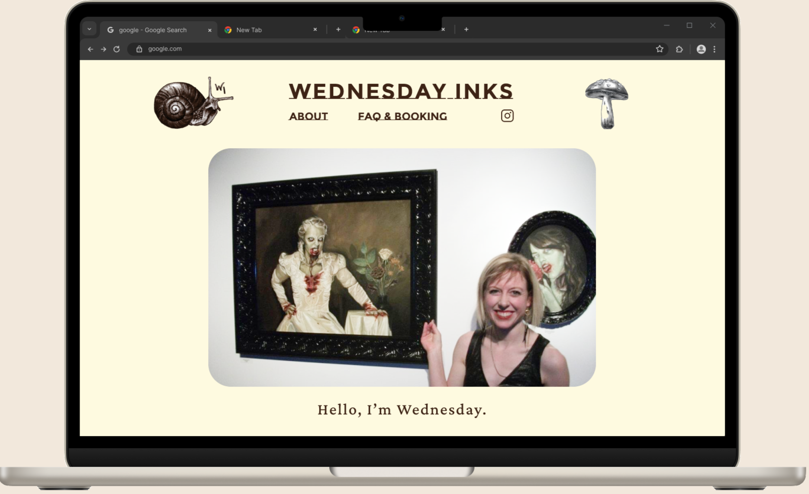
Meet the Artist
Disclosure of neurodivergence to build rapport.
Key Features
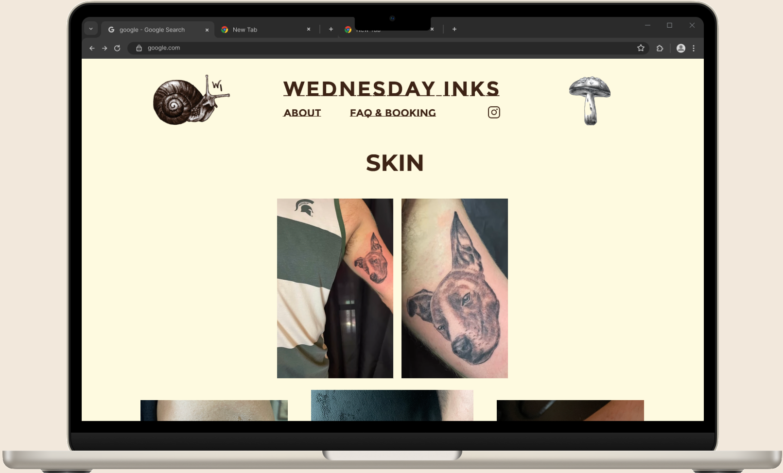
Filtered Portfolio
Categories for “healed” vs. “fresh” work.
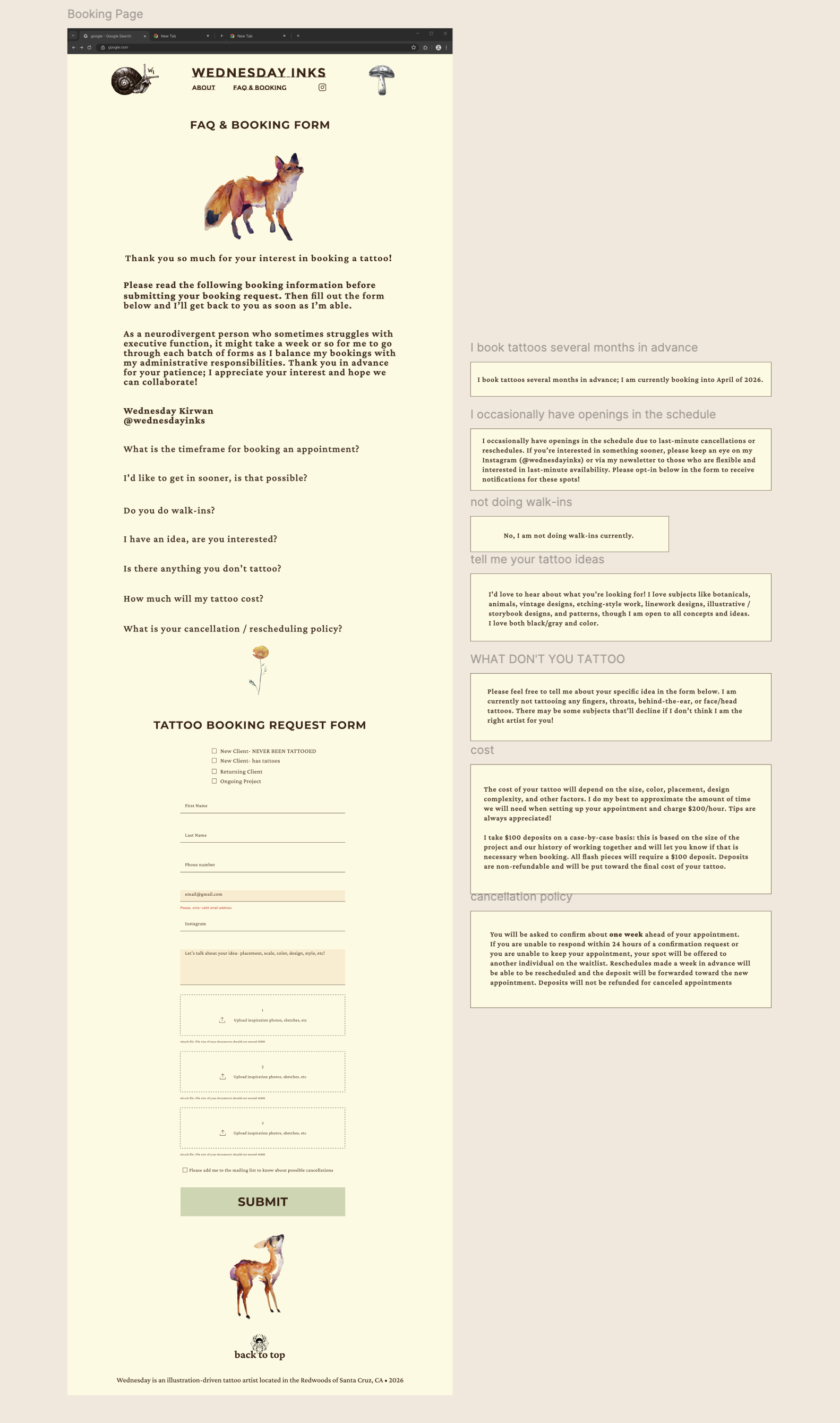
FAQ
Explicit information about everything from placement to cost
Detailed Intake
Including sensory preference checks (e.g. “Do you prefer silence?”).
also… I was wrong!
I incorrectly assumed my users would prioritize cost as important (or more) a consideration than their other values. In fact, their priorities consistently revolved around aligned aesthetics and values, with cost being a consideration only if and when similar styles and perceived authenticity allowed (which they often did not).
so I knew I needed to address this discovery in the design phase…
Effortless tattoo exploration: a balance between approachability and bespoke presentations of art and service
User Flow: navigating from the Gallery page to the About page, and to the FAQ & Booking page
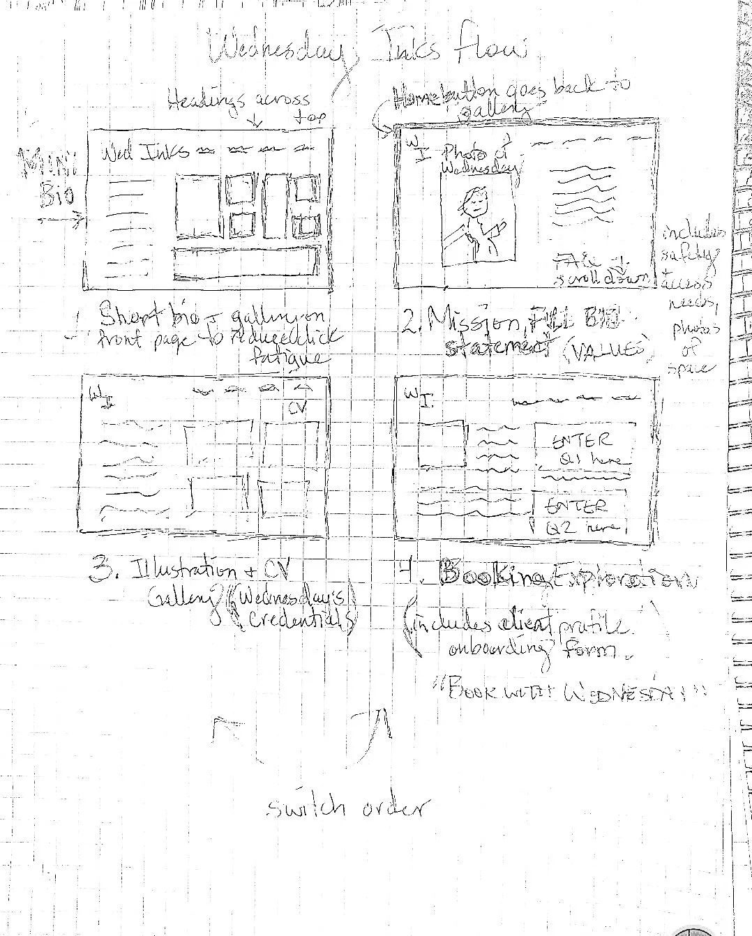
I began by prototyping at the most essential level, first sketching, then developing basic wireframes, and developing a more dynamic wireframe flow
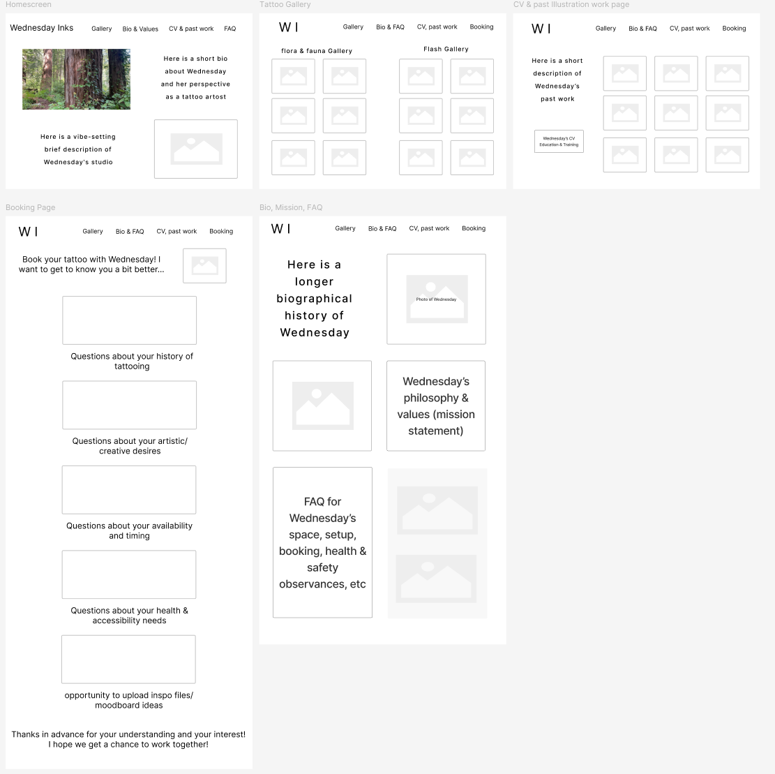
Mid-fidelity Wireframes: Iteration 2: Added a landing page and pivoted to a gallery approach to communicating visual information, relying on other artist’s gallery websites as inspiration.
High-Fidelity Mockups Iteration 1
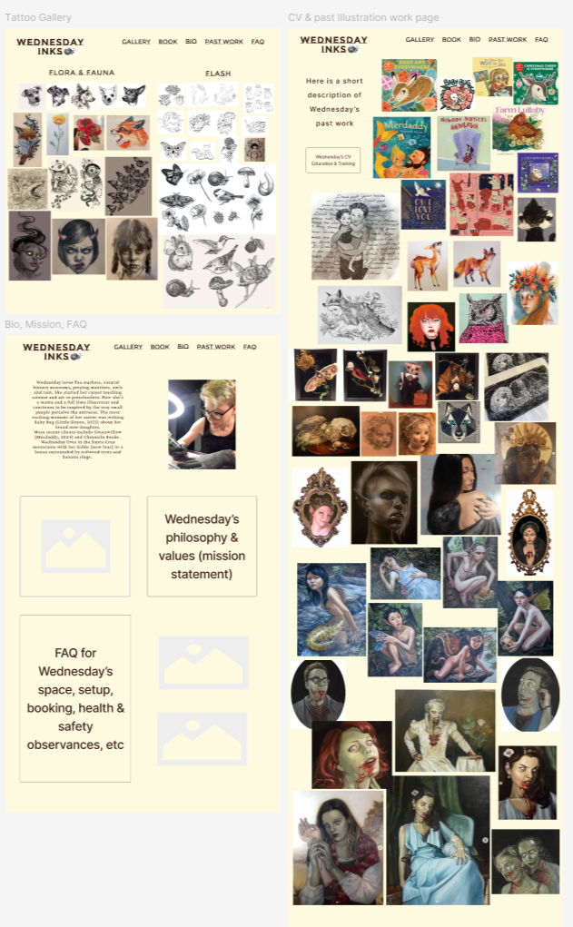
The Gallery and Previous Work page are cluttered and visually chaotic; further iterations were necessary.
…and I was wrong again!
When I started creating my initial layout, I was basing my initial designs on offering the fullest gallery possible; I incorporated every single visual resource that Wednesday offered. Because this initial intention didn’t actually match my user personas and their values/ideology, I ran into a design wall- the aesthetic was stressful and cluttered.
BUT, once I stepped back and reassessed my user personas, brand values, and goals, I realized I had been misguided; I curated Wednesday’s portfolio and refines it to the most essential elements, the assets that best represented the artist Wednesday was, is, and aspires to be.
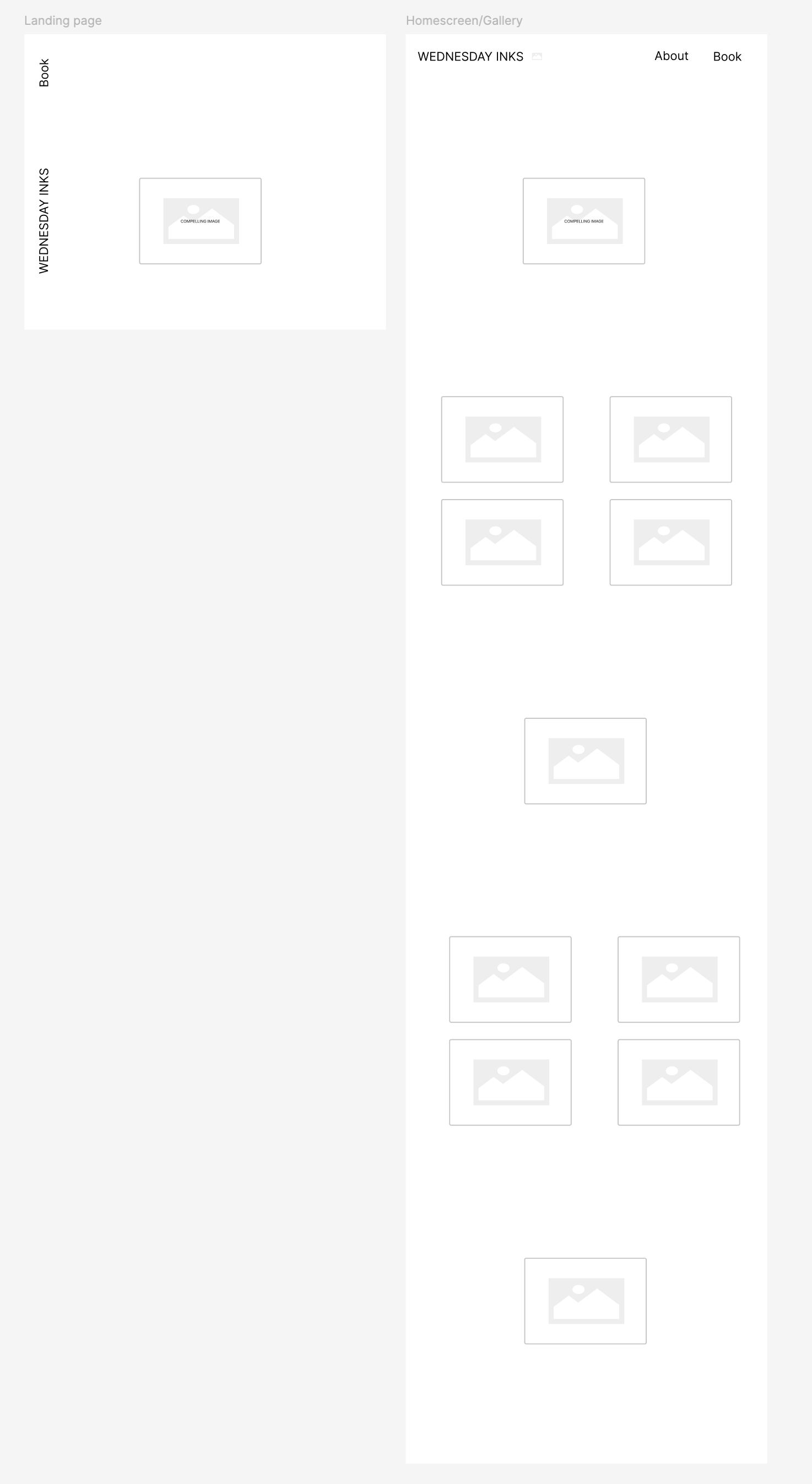
Iteration 1 - simplified gallery layout
Iteration 2 - removed landing page, incorporated into home page
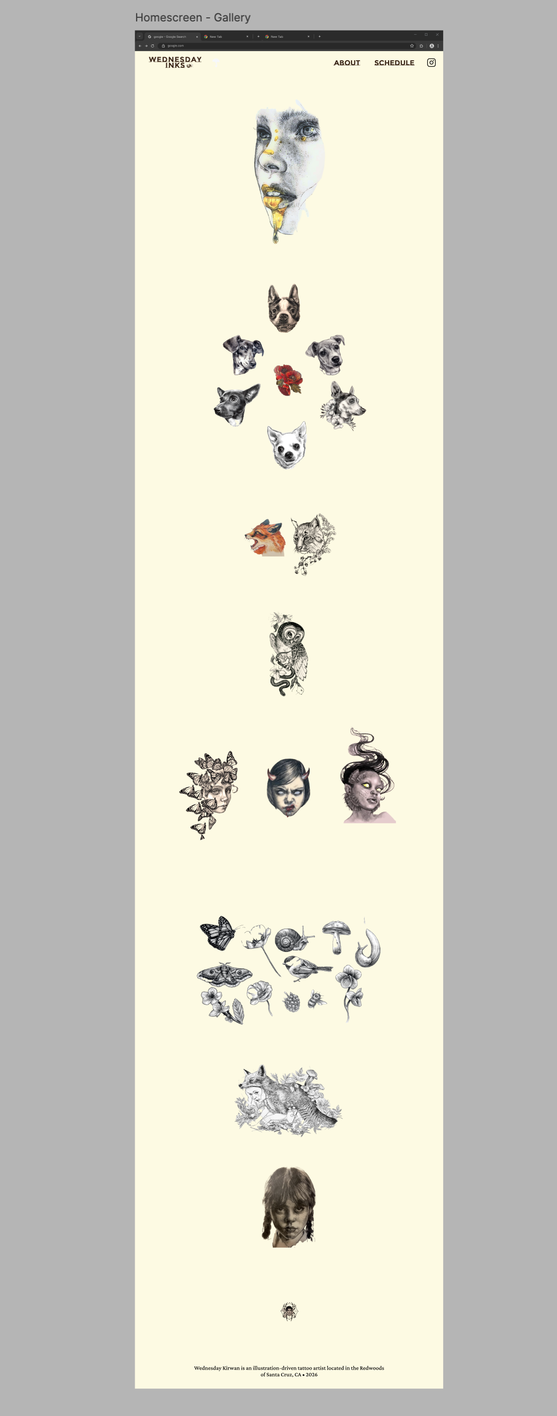
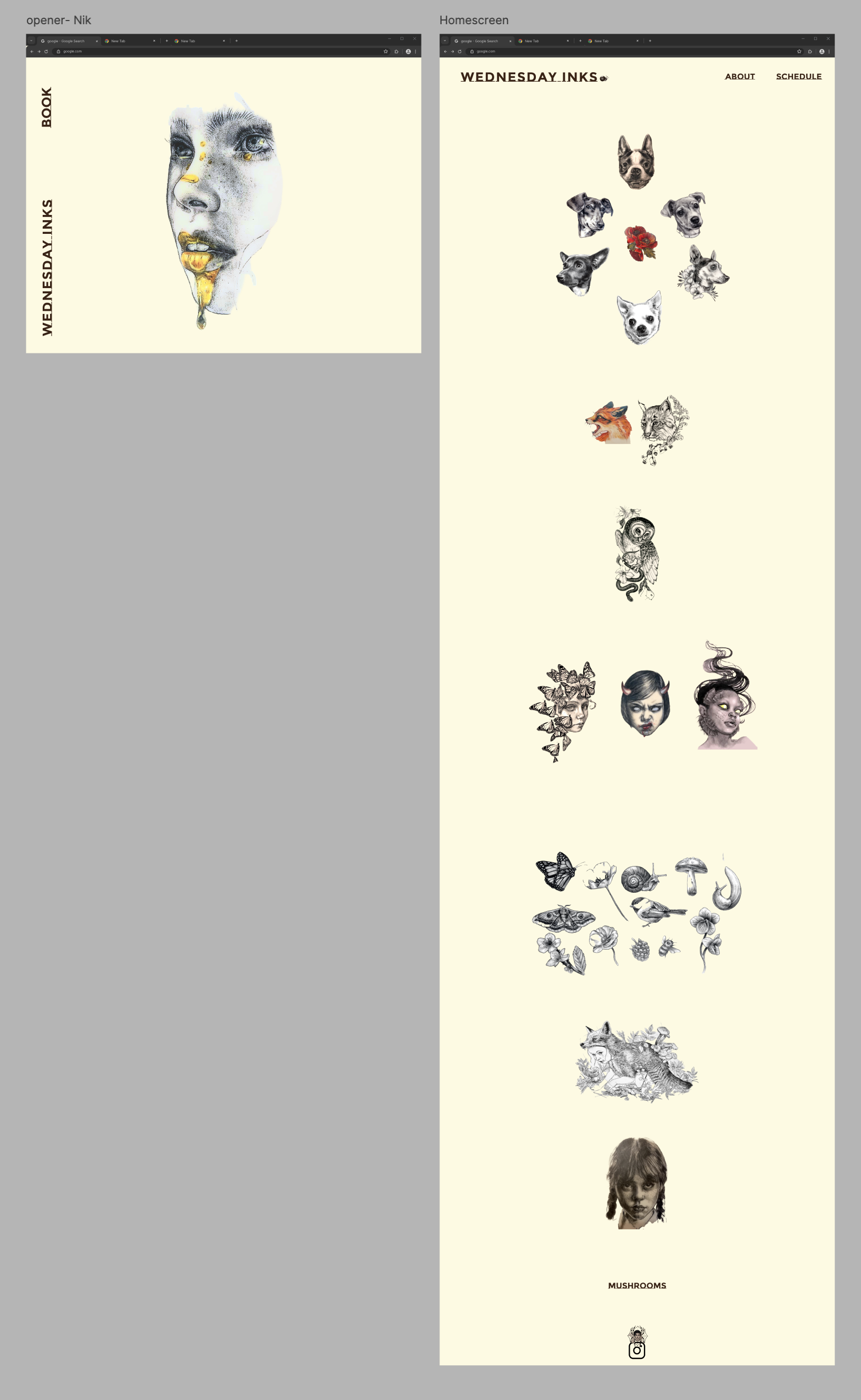
I redesigned the layout to reflect a lean gallery approach, valuing negative space as much or more than visual assets.
I relied on open spaces to provide balance, calm, and full breaths.
Creating an intentional aesthetic brand identity through the intersections of cute and macabre, relying on a bespoke art gallery approach.
I focused on a classic, accessible logo that combined storybooks elements with gothic noir.
Here, I embarked on usability testing through four basic task flows, observing 5 users as they interacted with my product
Users responded positively, but there was room to improve the UI.
I tested the concept with 5 participants who had experience with getting a tattoo. All of my participants liked the idea of a simple gallery and an Info section with transparent details about Wednesday’s tattooing process. However, critical feedback focused on the clarity of the UI design- and it turns out three out of five of my users are neurodivergent!
features that worked:
The beskoke art gallery approach was reported to be accessible and consistent in terms of sizing and tone, which contributed to a purposeful feel.
The layout of the Gallery and About Me sections were found to be compelling and clean, and the overall aesthetic was appreciated by every user, who offered compliments on the design, unprompted.
reported user experience issues:
All five users suggested various fixes to address accessibility pain points (the FAQ was wordy, overwhelming, and embodied “Tl:dr”).
Nearly all users requested that the homepage feature contextualized tattoos on skin, in addition to the decontextualized imagery I’d intended to remain neutral.
Final iteration:
broke out & renamed FAQ section, revised header, tweaked the flow
The home page became the main feature, a central point allowing users to quickly establish values and aesthetic alignment.
Designing the wireframes revealed how critical it was to make the art gallery layouts concise. With endless options for choosing a new tattoo artist, there were too many opportunities for cognitive overload. Through several iterations, I condensed the gallery and FAQ to create space, trust, and establish brand values
I worked with Wednesday to neutralize asset backgrounds and tweak some minor copy; the client approved and signed off!
Client approval was paramount; despite the final iteration of this project receiving user satisfaction, I wanted to ensure Wednesday received final approval. Getting the stakeholder to sign off was the last step.
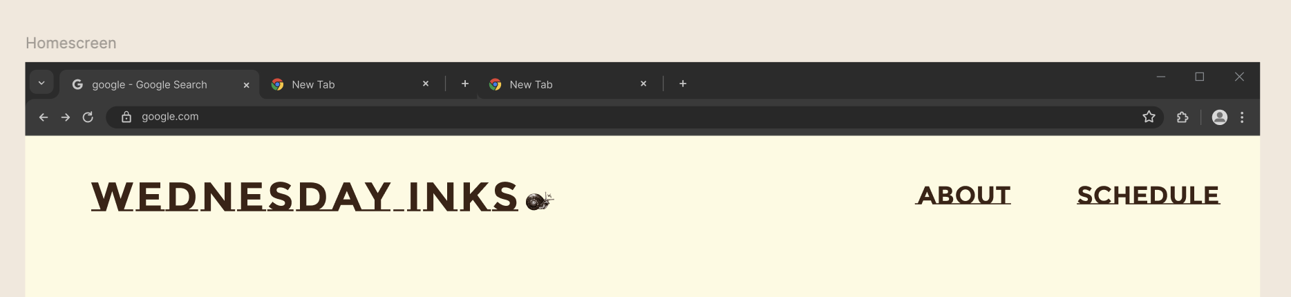
Header Before
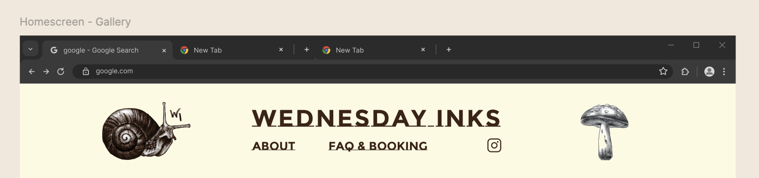
Header After
Final Design:
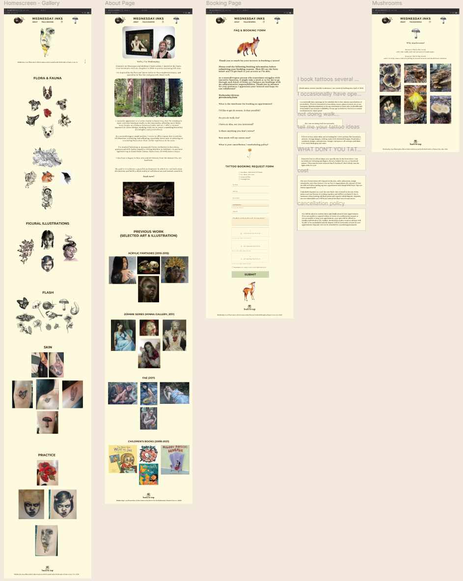
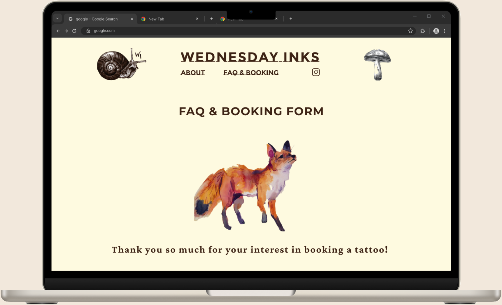
Wednesday Inks: final user flows
Gallery scroll
FAQ & Booking form
About
Easter egg
(at client’s request):
a page about mushrooms!
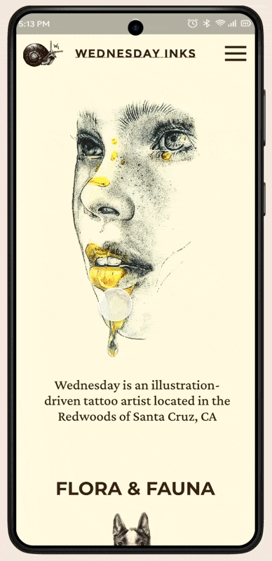
Responsive mobile design
Interactive Prototype:
The Wednesday Kirwan experience
a Digital Sanctuary for Inclusive Tattooing
Click below:
Reflection:
Future Innovations and Growth Opportunities
Bringing Wednesday Inks to life was a deeply rewarding experience. I was pleased to work with a real-world client; while this is something I have extensive experience with in other contexts of my life, I haven’t yet had this experience in the context of UX, and found it to go surprisingly well; the biggest challenge was simply aligning with my client on timelines and asynchronous communication, which can be attested to a very busy work/life balance and a difference in time zones.
High-Fidelity Expectations: I learned that in high-fidelity testing, I cannot cut corners on interactions; I must build out every minute interaction (like calendar dates or modal closings) because users expect realism and will get confused by static prototyping.
Handling Feedback: I learned how to distinguish between outlier feedback (one person strongly liking or disliking something) and critical usability issues, and then understanding that as a designer, I must make defendable decisions.
This project significantly deepened my understanding of how diverse user processing impacts design, particularly regarding neurodivergence. I learned that accounting for different flavors of perception and processing information made testing challenging but resulted in more accessible spaces, and accessibility experience has limitless potential when working with future clients.